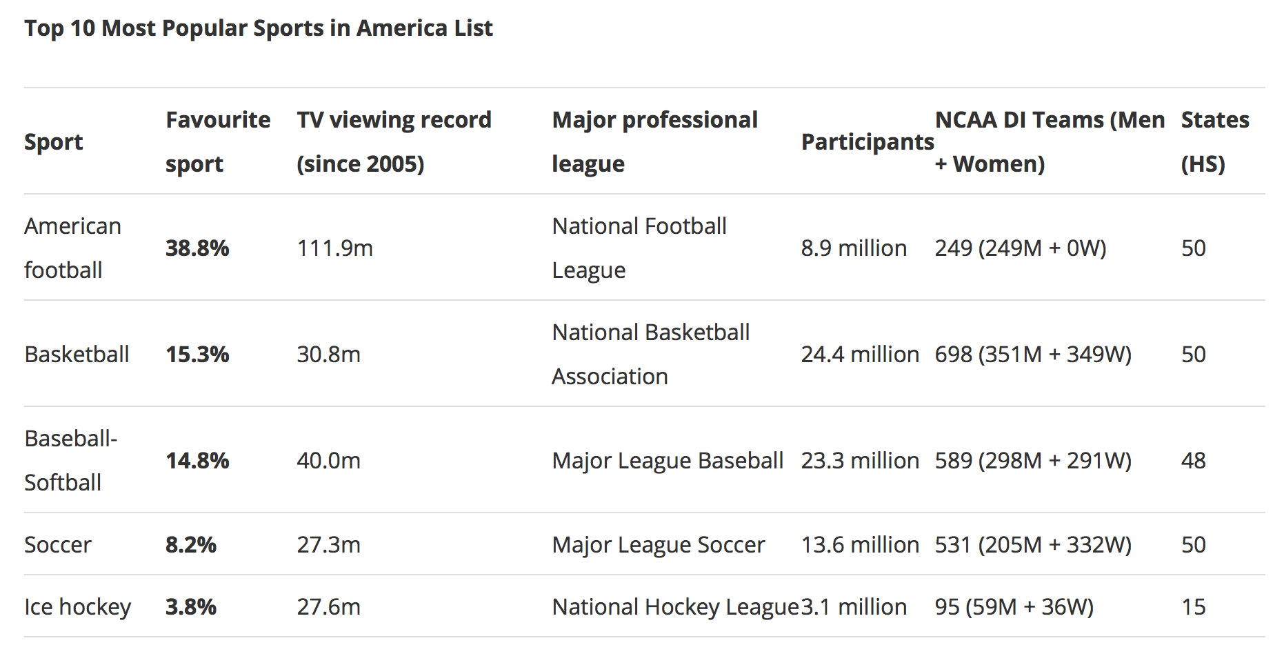
The flow of information and data online has taken control of how people think and perceive information. But sometimes too much data can confuse people when too much is thrown at them so it is important to look at things like information visualization to make sure people understand the information they are presented. Defined by Andrew Losowsky as the art of representing data in a way that is easy to understand and manipulate, information visualization is key to helping make information accessible but also useful. Losowsky breaks down the common uses of information visualization into presentation, explorative analysis, and confirmation analysis. Not only should people be able to understand the content being given to them, but they should also be able to pick up on visuals and patterns to further the meaning of it.
In order to have effective information visualization, a designer also needs to take into account how they want to show the data. In his article The Elements of Information Visualization, Card Mackinlay brings up three elements that can be used to break down information visualization through the method of visual mapping. First comes spatial substrate which relates to the axis (x,y,z) that can present the visuals in either a 2D or 3D setting. And then comes the graphic elements which can cover things like points, lines, surfaces, and volumes. Graphical properties can then cover things like size, orientation, texture, color, and shapes. These properties are meant to help enhance in the information visualization but should also be used sparingly and smart. Functionality is one of the most important things to keep in mind.
After studying the work of Sarah Illenberger, I was able to apply these techniques and principles in creating my own representation of qualitative data that reflects on the information visualization. I explored around my house for objects that were connected to each other and then settled on the idea of using my jerseys to help represent the most popular sports watched in America as voted on by Americans. Using my jerseys, I was able to represent the NFL, NBA, MLB, and NHL respectively with a team from each league. Instead of laying out the jerseys or hanging them as they were, I decided to visually present them in a way that related to the data. Using spatial substrate, I arranged the jerseys in a way that represented them in a bar graph fashion. The length of the jerseys shown in the graphic are related to the percentage each league received in the vote. The NFL sitting at 77.6% appears larger than the rest and the NHL sits at 7.6% as the lowest. One thing I made sure to keep in mind in terms of color was not having duplicate colors of jerseys so as to avoid confusion of making viewers think there was relation between some of the jerseys.
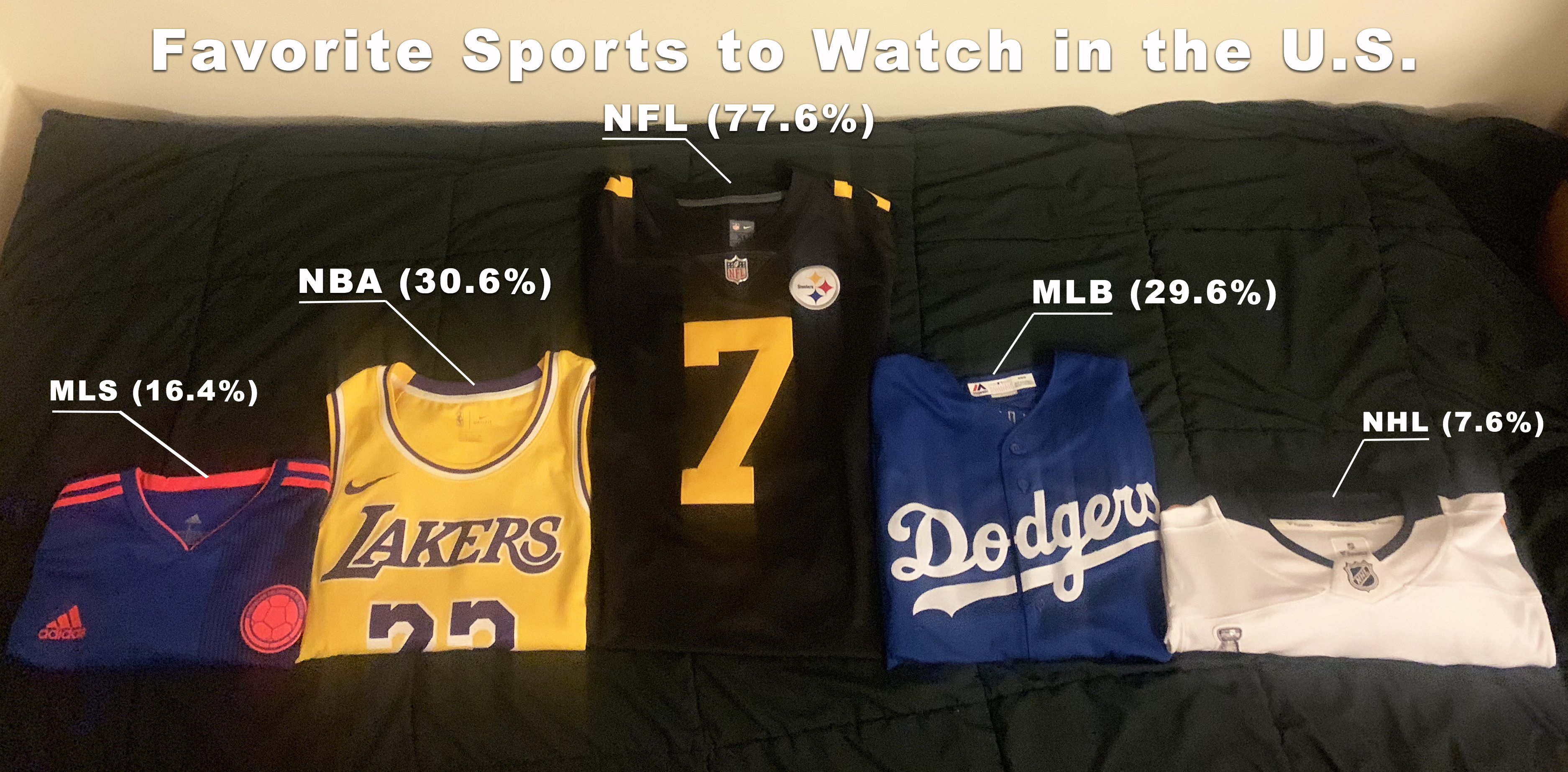
I had thoughts of arranging the jerseys in order from most popular sport watched to least popular and vice versa, but I then decided to take the visual approach of recreating a podium set-up as seen in medal ceremonies. The NFL jersey sits in the middle to show its dominance in first while the NBA sits to the right and MLB to the left for “2nd and 3rd place.” Although it is
I then added in a key for graphic elements and properties to show the percentages from the vote and linked them to each of the jerseys. The size of each font helped to further represent the difference in percentage for each of the leagues.