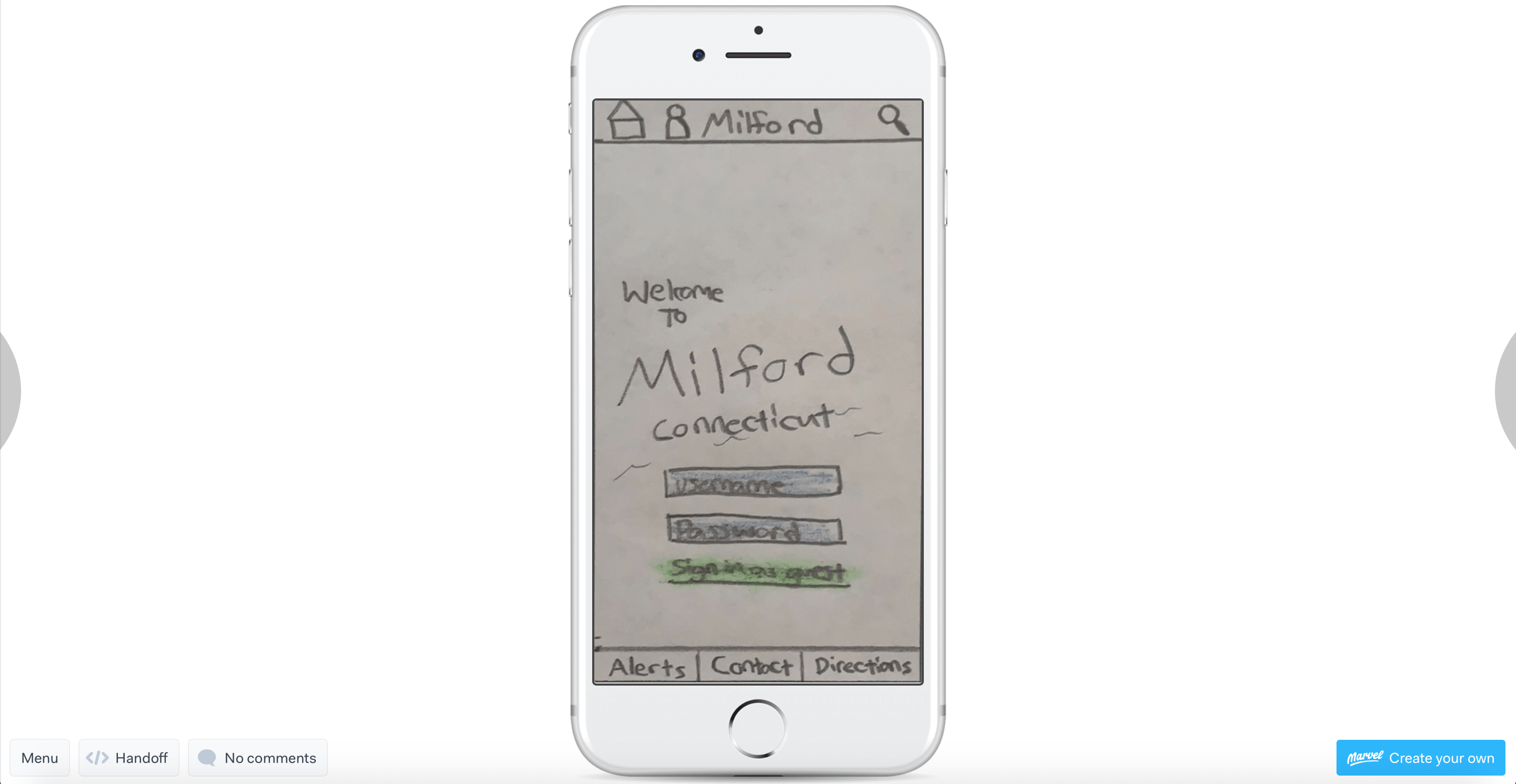
After completing my paper prototypes last week I was able to begin user testing this week using the prototypes I created on my POP creation. I knew that all of my designs would not be perfect in the first go around of testing but to have someone else’s eyes who hasn’t seen the app yet was important in helping me to make sure the user navigation was fluent after going through the information architecture and flowchart processes.
I was able to use the paper prototypes again in the user testing phase because I had used them to visualize how user would navigate through app and hopefully follow the path I laid within it for each of the tasks I set up. If need be paper prototypes are also easier to change on paper and to take notes to improve after going through the testing phase. For the user testing I used an app called POP by Marvel which allowed me to take pictures of my wireframes and animate them to navigate to all of the different pages with the links I set up.
I decided to enlist the help of three testers to help me test out my app. One of which who is a current resident of Milford, one who is looking to move there possible one day, and another who is familiar with the area only a little bit. Each of the participants would engage in the three different tasks that I laid out through the use of the information architecture and flowcharts I had created prior to the test. This would allow me to help analyze and see if the users were able to navigate and follow the same path I had in mind for them.
I wrote out a script which I read to each user prior to testing to let them know about how I wasn’t testing their performance on the app individually but rather the durability of the navigation of the app itself and that their feedback will help me to take note of both the positives and negatives of the app so that I can better improve it before moving on to the next developmental phase.
Some of my key findings were that the naming of the different icons is very important as the users were able to navigate some spots easily such as the news/events tab while the information and resident’s tabs were mixed up sometimes when trying to find school and sports related content. I also found that some users were unaware of when they officially completed a task due to there being no “confirmation pop-up” that informed them they correctly signed up or added an alert. Some users also suggested to me that I shorten up the necessary steps to reach the goal of a task. For example, one person suggested that I add the calendar addition option to the main page of the school event calendar instead of creating a separate page for it. This can relate back to information architecture which helped explain that the less material and words people are given the less overwhelmed and confused they will be which is what I strive for as I moved forward with all my notes from testing for this app.
Works Cited
Krug, Steve. “Usability Test Script.” Sensible, Rocket Surgery Made Easy, 2010, www.sensible.com/Downloads/test-script.pdf.
Martin, Roger L. “The Unexpected Benefits of Rapid Prototyping.” Harvard Business Review, 2 Nov. 2014, hbr.org/2014/02/intervention-design-building-the-business-partners-confidence?referral=03759&cm_vc=rr_item_page.bottom.
Mifsud, Justin. “Paper Prototyping As A Usability Testing Technique.” Usability Geek, 24 May 2018, usabilitygeek.com/paper-prototyping-as-a-usability-testing-technique/.


