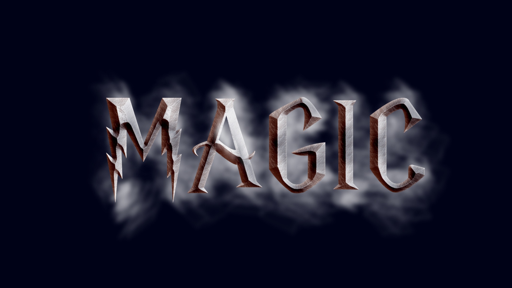
For this piece I knew I wanted to combine the abilities of Adobe Illustrator and Photoshop to see how they can play off each other to create the best images possible. I looked through a number of tutorials on how to recreate fonts in Illustrator and came across a couple ones that looked at movie titles like Tron and Star Wars. And then I came across a Harry Potter tutorial and instantly knew I wanted to recreate it using the word magic.
Naturally the only letters that could be used were in the name Harry Potter so I researched a template that followed the brand guide of other “Potter” letters with the signature lighting and serif and found one created by Maddie Rodgers that I could use for reference. I then opened Illustrator and began constructing the letters for the word magic using the pen tool. I made three sets of words, one with all caps, one with an uppercase “M” and the rest lowercase, and then one with all lowercase. I looked at all three side by side and decided that the all caps one looked the best.
I then brought the letters into Photoshop for the next step. The tutorial I used to recreate the text was created by YouTuber Howard Pinsky who taught me about the different things one can create in the layer styles panel and gradient overlay. Bevel and emboss helped to give a three dimensional depth to the shapes of the letters and a linear burn created the shadows on them.
Adding a contour created the outline adding the rusted metal texture gave it the stone feel of red and silver. One key point brought up by Pinsky was to turn off the global light to have the light source come in from one source and have the rust texture more apparent while satin gave a silver look.
In order to sell this word as feeling magic, I wanted to add another text effect. I came across a smoke tutorial in my searches which intrigued me but I felt on its own it was too hard to see the actual word. But together with the other text it could help add another layer to it. In a tutorial by Mathias M. Stav, I was able to create a smoke brush in Illustrator. To do this I used the pen tool to make vertical line and them copied and pasted the line to the right multiple times to create almost a rectangle shape and then turned down the opacity. I then drew a smoke shape with the pen tool and selected both objects and then went to object, envelope distort, and make with top object and then made a new art brush. The Gaussian blur helped to smooth out the smoke more, and then I was able to free draw the words magic using the pencil tool and adjusted the stroke weight as needed.
I placed the smoke behind the word magic to give it a glow and outline but also had the smoke leak through the letter “A” to give it a sense of depth and work almost like a chimney would naturally. I then added a black background and a navy blue one but turned the opacity down to mix the two into the dark night vibe I was looking for. I tried using the lens flare tool to give the piece a magical light but couldn’t find the right combination I was looking for even with turning down the opacity.
Works Cited
Pinsky, Howard, director. Harry Potter Text Effect in Photoshop (Deathly Hallows). YouTube, YouTube, 29 June 2011, www.youtube.com/watch?v=2MGVCgU0XTs.
Rodgers, Maddie. “Harry Potter Alphabet Font Stencil This Listing Is for Individual Letters. Please Select the Size and Letter You Need. I Also Have … | Projects to Try | Harry Potter Alphabet, Harry Potter Font, Harry Potter.” Pinterest, www.pinterest.com/pin/829014243879541312/.
Stav, Mathias M. “How to Create Smoky Brushes and Type In Illustrator CS4.” Design & Illustration Envato Tuts+, 23 Jan. 2012, design.tutsplus.com/tutorials/how-to-create-smoky-brushes-and-type-in-illustrator-cs4–vector-3226.


Bret, this work was so refreshing! I did immediately think of Harry Potter when I saw it. As that film series is all about magic, I’d say you hit the nail on the head. I liked your Bevel and Emboss but particularly on the letter M. The section at the top where the M is flat where the lines meet is my favorite. There are so many shadow’s, colors, depth, style and fun in that section that I just keep staring at it. The smoke is almost required now. The word itself would probably have been enough, however now that I’ve seen it with the smoke, it wouldn’t be good enough without it. It gives that feeling of fantasy and self searching of whether or not my magic will be used for service or personal gain. You really did a wonderful job here. Thank you for the fun.
Hi, Bret!
As a Harry Potter fan, I really enjoy your word! I’m extremely impressed that you made the letters yourself I feel that is an accomplishment! Your colors embody the feeling of the franchise really well and the smoke in the background adds to the whimsy.
Nicely done!