There were three total users that I had test out the Miflord Town App. One a current resident of Milford, another looking to move there possible one day, and another is familiar with the area only a little bit. Each of the participants engaged in the three different tasks that I laid out through the use of the information architecture and flowcharts I had created prior to the test. This would allow me to help analyze and see if the users were able to navigate and follow the same path I had in mind for them.
Some of my key findings were that the naming of the different icons is very important as the users were able to navigate some spots easily such as the news/events tab while the information and resident’s tabs were mixed up sometimes when trying to find school and sports related content. I also found that some users were unaware of when they officially completed a task due to there being no “confirmation pop-up” that informed them they correctly signed up or added an alert. Some users also suggested to me that I shorten up the necessary steps to reach the goal of a task. For example, one person suggested that I add the calendar addition option to the main page of the school event calendar instead of creating a separate page for it. This can relate back to information architecture which helped explain that the less material and words people are given the less overwhelmed and confused they will be which is what I strive for as I moved forward with all my notes from testing for this app.
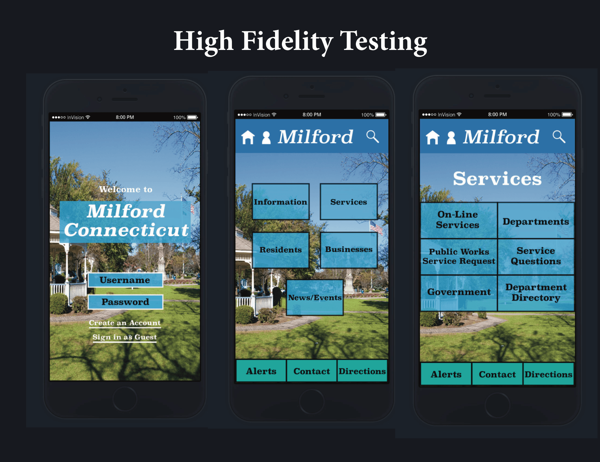
When I began the search process for high- fidelity programs, I knew I wanted something that was easy to use but also produced the highest quality of work. When I first went onto invisionapp.com I was immediately drawn to their user layout. It allowed for quick and easy uploading of screens as well as swapping out screens if need be. It also allowed for a similar setup to that of the Marvel App which I used for the paper prototyping testing on my phone where you could add links to the “buttons” on the screens that sent you to the different pages. Once I uploaded all of the screens onto invision, after creating the high fidelity versions in Adobe Illustrator, I was able to recreate what I did in the app on the site for creating a walkthrough of the app.
Some things that changed in the app after user testing was the addition of confirmation popups. I found that some users were unaware of when they officially completed a task due to there being no “confirmation pop-up” so I added those to the end of the sports registration and school calendar pages. I also added a main school page so that the parents and students could know where to navigate. I then brought the “add to calendar” option the main page of the school event calendar instead of creating a separate page for it to help create one less step. I also added in the option to return to the home screen of each section and not the app home screen in case users wanted to go through the tasks again instead of having to be taken back to the beginning when they already know which section they want to be in.
What I learned from this process was that user testing is the make or break part of the visual design process because designers can either improve upon what they’ve created or set themselves up for issues later on that could’ve been addressed during this step. Some designers make take everything they learned in the user testing phase and apply it to their high fidelity design, while others make take the issues they saw pop up the most and ignore the ones that came up more coincidentally than frequently. And some may choose to ignore everything which is a big mistake.
But what I want to bring is how the user testing can help to take a good app to a great app. And this starts not on this step but in the early stages of the process in ideation. If the designer does not put the willpower and thinking into their early ideation sessions of empathy for the user and navigation through the app, then all of the issues and improvements will come up during the user testing phase. But if they’re able to go through and see for themselves all of those minor issues that can be correctly right away, then it helps to filter out the issues that designers can’t see until user testing and allow for more valuable feedback that can’t be discovered except through user testing. Time is valuable during the user testing phase to help fix and improve the app and it shouldn’t have to cover things that could’ve been addressed in earlier stages of the design process.


