The homepage for a website is one of the most critical components for a company especially in a growing market of online interaction and accessibility. And although technology has changed over the years and has caused most companies and their online content to adapt to new screens such as smartphones and tablets, the core principals of visual design and composition remain the same to help create the best possible experience for users while still representing the brand. For this week I was tasked with not only creating a homepage for my fictional company, but also a mobile version to help see the similarities and differences between both layouts.
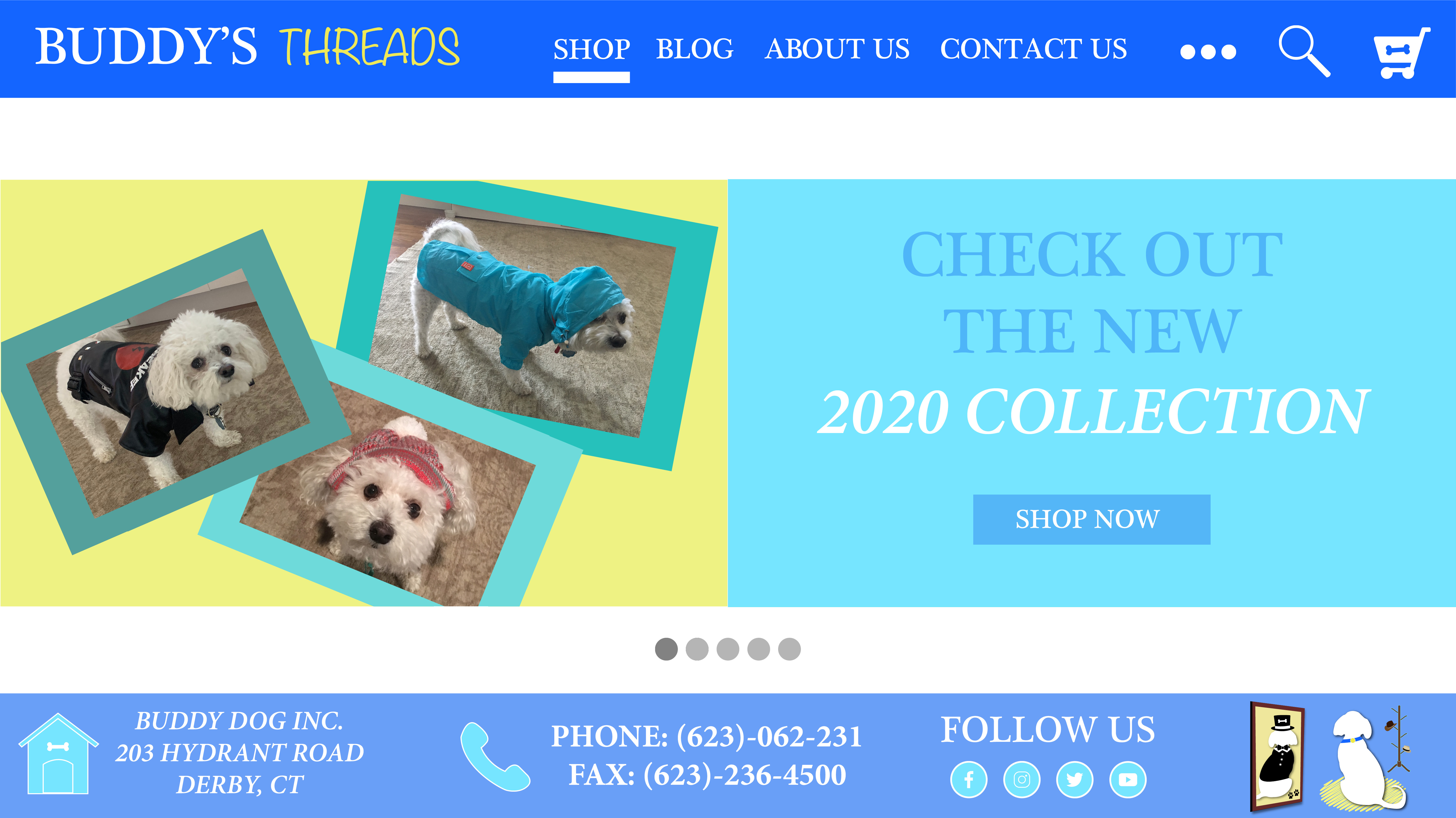
Robin Landa, in her book Graphic Design Solutions, defines the homepage as the primary entrance to the website and is responsible for containing the central navigation. So when designing my homepage, I made sure to incorporate the right colors and layout to grab the attention of the viewers, but also not overwhelm them. According to Landa, the mind will register color before shape. I chose the color blue to stick with the company color scheme for consistency but also because it represents trust and a feeling of freedom to move around almost like the blue sky. And consistency in color helps to create trust (Kolowich). And there are a few white spaces to help further separate grouped elements from each other but also avoid crowding the edges.
I also added a dropdown menu for additional tabs that could take experienced site users farther in but still have the main tabs accessible and easy to find for those new to the site. As for the order of the tabs I prioritized that the site should offer to users and highlights with a rectangle underneath to show where the mouse hovers over. With that in mind I placed the “Shop” tab first thinking users would go to a dog clothing site to buy the clothes and then also check out the community blog to see dogs in the actual product. I also placed a shopping cart tab so that it was easier for users to see what was in their cart while also speeding up the checkout process when they are ready to exit the site. According to Parham Aarabi in his article 5 Tips for Creating Great Mobile App User Interfaces, having more buttons present makes it harder for users to choose where to touch/click. That is why I decided to include a magnifying glass for the search tab and shopping cart in the top right. As for the center of the page I decided to include a rotating set of pictures which help to feature the product with current updates about the brand to help draw people back to the site to see what’s new right away on the homepage.
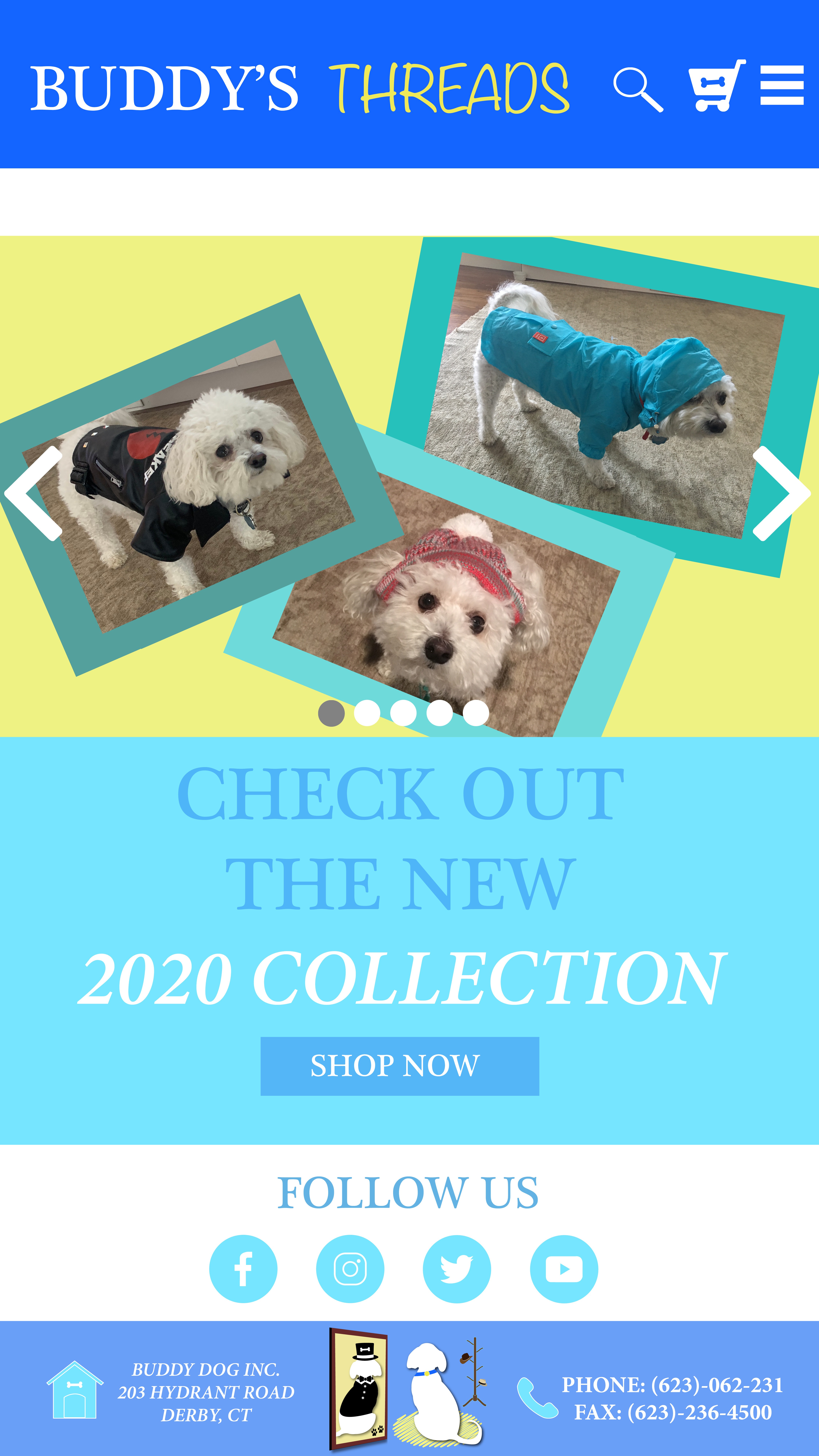
Going to the mobile version I kept most of the elements consistent but rearranged them in a few areas to create a better flow for the phone screen and using the correct amount of space. Dakota Reese Brown in her article the Four Key Principles of Mobile User Experience Design talks about how mobile devices have the smallest screen in user experience, which means they must be accommodate more for user attention span. I decided to remove the tabs from the header and instead included the dropdown menu because of the amount of limited space but still made it available and easy to find for users being drawn to the header first with color choice and the brand name next to it.
One key element I decide to include in both the web and mobile version was the call to action tabs. “Shop now” and “follow us” influences the user to click on the provided links which show trust and scare users away with flashy animation or inconsistent neon or red color. The social media tabs have a more prominent appearance on the mobile page because of the likelihood people will click on the social media links to open additional apps and see the other pages on their phone as their main social media hub rather than a computer. I also decided to include arrows on the rotating images to help guide the users thumbs to change the pictures for themselves and not be confined to the same images on the homepage.
Works Cited
Brown, Dakota Reese. “Four Key Principles of Mobile User Experience Design.” Boxes and Arrows, 19 Nov. 2009, boxesandarrows.com/four-key-principles-of-mobile-user-experience-design/.
Cerejo, Lyndon. “A User-Centered Approach To Web Design For Mobile Devices.” Smashing Magazine, 2 May 2011, www.smashingmagazine.com/2011/05/a-user-centered-approach-to-web-design-for-mobile-devices/.
Koetsier, John. “5 Tips for Creating Great Mobile App User Interfaces.” VentureBeat, VentureBeat, 12 Dec. 2018, venturebeat.com/2013/04/08/5-tips-for-creating-great-mobile-app-user-interfaces/.
Kolowich, Lindsay. “The Anatomy of a Winning Website Design [Infographic].” HubSpot Blog, 9 Oct. 2015, blog.hubspot.com/marketing/anatomy-web-design.
Landa, Robin. Graphic Design Solutions. Cengage, 2019.
Lynch, Patrick J., and Sarah Horton. “Web Style Guide, Third Edition.” Contents | Web Style Guide 3, Sarah Horton, Patrick Lynch, www.webstyleguide.com/wsg3/index.html.
McQueary, Alex. “Website Anatomy 101: Web Design Vocabulary You Need to Know.” Wired Impact, 1 Mar. 2019, wiredimpact.com/blog/web-design-vocabulary-101/.
Young, Nancy. “20 Mobile User Interface Design for Your Inspiration.” Hongkiat, 18 Nov. 2017, www.hongkiat.com/blog/mobile-app-ui/.


Hi Bret.
I’m an animal lover as well as someone who appreciates details; therefore I must tell you that I really appreciated the bone you put in the shopping cart of your mobile site. Well done!
I like the design choice you made to put the photographs on the diagonal, but wonder if your colors could be a bit more subtle (mostly the yellow). I like the blues but I think I would consider changing the hue of the yellow background to tame it down a bit.
The dog’s reflection in the mirror is also a nice touch. You could also consider adding some depth to your text and images for impact.
Overall, very engaging and entertaining.
Best-
Holly