Brochures have the ability to translate powerful messages and imagery to readers and customers if designed properly. But complications can arise if things like the grid and proportions are not taking into account during the design process given the amount of limited space being worked with. That is why it is important to take into account every element and factor going into the brochure so that they play off of each other and make sure they add something to the brochure and not just take up unnecessary space.
In her book Graphic Design Solutions, Robin Landa discusses her five factors to consider when designing a brochure. How the brochure system will work with the existing identity system, the type of content, how to communicate it, the function, and the budget for printing. But she always brings up a number of good points to getting started with the brochure design, such as how to generate and design a concept, basing it on the characteristics of visual identity, and then the illustration, photography, and typography.
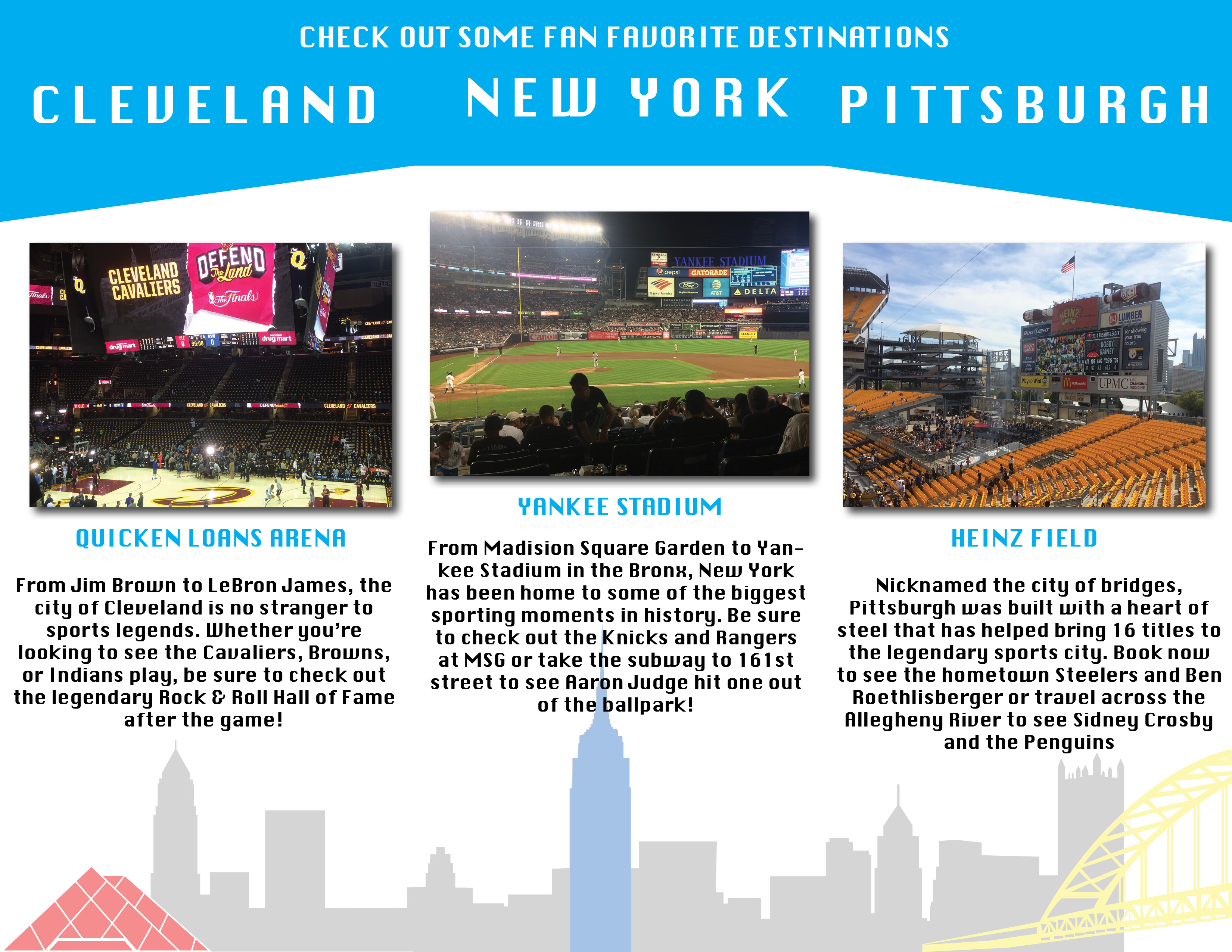
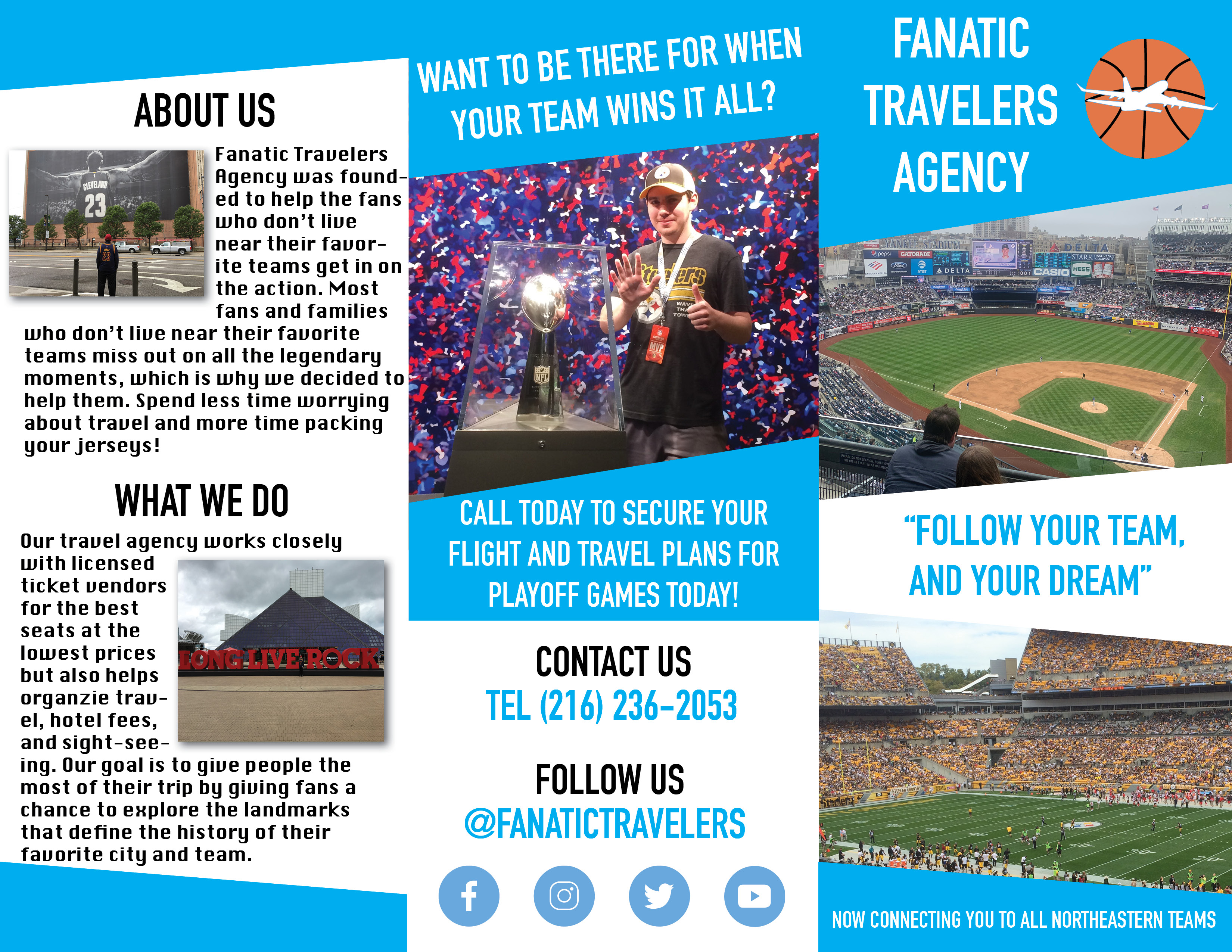
For the photos in the brochure I knew they would be a major component in “selling” the company to the reader, but I also knew that I was limited in space. That is why on the first page I knew the first impression was key, so I was able to scale up the images to bleed of the edges but also use shapes to house the text and separate the pictures. On the inside was able to create spatial separation between each of the cities by using the headers but also the city skylines which help create a flow between the columns and guide readers from left to right.
One major key takeaway I took from this project was the importance of prototyping and checking for functionality. I wanted to make sure that there was a flow to the brochure as well as coherence because it should engage the reader to want to read through the entire brochure while also conveying all of the information both effectively and clearly. When setting up my design initially, I kept in mind the flowlines and how they interacted with the rows and columns within the multicolumn grid, which separated the inside into three different sections
When it came to the typography for the brochure I took a look at Rebecca Creger’s 11 Techniques for Breaking the Typographic Grid. This article helped to get the ideas flowing by looking at examples of outside the box thinking for typography design while still maintaining the brand and grid guidelines. Two concepts I chose to apply to my brochure were tilting text and wrapping text. The tilting text I used sparingly so that when it was used it caught the attention of the reader and gave them a call to action on the back of the brochure so that I wasn’t overlooked. The wrapping text I used to space the longer paragraph text around the pictures I had. Working with a limited amount of space I used this element to help create more white space on the brochure as well as create a spatial zone between the text and corresponding image with it.
Works Cited
Creger, Rebecca. “11 Techniques for Breaking the Typographic Grid – Designer Blog.” 99designs, 99designs, 13 Feb. 2015, 99designs.com/blog/tips/11-techniques-for-breaking-the-typographic-grid/.
Landa, Robin. Graphic Design Solutions. Cengage, 2019.