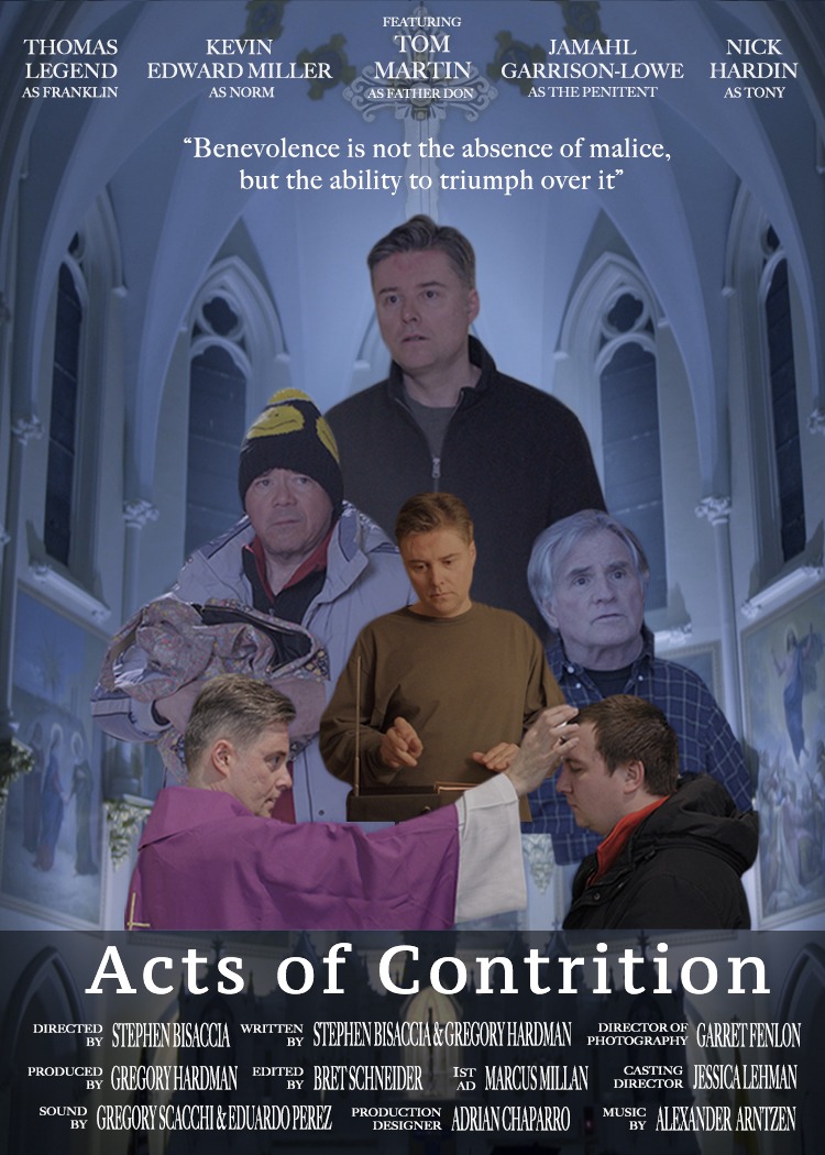
For my poster design I decide to do one based off of my senior thesis short film Acts of Contrition. The story follows a priest by day and ride sharing driver by night who struggles with his past and loss of faith while trying to prevent the death of a penitent. My role in the film was the editor and while putting this film together I discovered a number of elements within the visuals and story such as the interactions the priest has with the people he comes across and how his character changes from the beginning moments of the film to the final scene. To start out the design I laid out the images I found most powerful from the film and began arranging them. Once I found my background of the church at night though I was able to better position them compositionally to help create a balance.
I laid the text out at the top for the actor’s names because they are a marquee component of the film. I felt that placing the names at the top would help to buffer people’s eyes from trying to look beyond the top of the ceiling. I placed the main actors name, Tom Martin, at the center and also included the films cross/car key logo to draw attention to his name but also point down at the tagline “Benevolence is not the absence of malice, but the ability to triumph over it. As for the text I centered the type alignment and placed each with the same amount of space on the same line.
As for the characters I knew that Father Don needed the most attention. Once I placed him at the top I positioned the other characters down below him and scaled them down lower than him on the pyramid build flow I was creating and also played with the opacity. I chose a pyramid shape to help the viewer flow from the top to the bottom and see the balance of life Father Don has both inside the church doors and outside. I then used the Ash Wednesday picture of Don placing ashes on a churchgoer to help frame the other characters within the frame to help keep attention at the center of him playing the Theremin but also to allow for the murals in the back to be seen.
As for the images themselves I brought down the brightness and exposure for some so they didn’t stand out from each other but I kept a consistent blue feel, as felt by the church at night, for most of the characters. I decided to keep the Theremin shot a warm feeling though because in the film Father Don’s feels the safest at the rectory with his instrument and uses it to help balance his other components of life. This was a late addition to the piece because I feared the center of the pyramid could be a focal point as described in Graphic Design Solutions. This meant that people seeing the poster for the first time could be drawn right to it and something needed to be there for the other elements to revolve around almost like a clock. Feeling that the images were still flat and needed depth I decided to add an outer glow and shadows for the layer style to help give a three dimensional feel with separation from the background.
In order to keep Don as the dominant figure I gave him the most glow at the top by increasing the size for the softer element and give a sense of the presence of a spiritual being. As for the car being on the black rectangle, I lowered the opacity to help it blend better and placed it on the black rectangle which helped to separate the titles from the background which otherwise blended in. As for the title Acts of Contrition I wanted to give it a presence by increasing the size of it and used the kerning element and letter spacing to give it space to breathe between the letters and cover more space and frame it up with the crew credits and the Ash Wednesday pic.
Works Cited
Kolowich, Lindsay. “Color Psychology in Marketing [Infographic].” HubSpot Blog, 3 Nov. 2017, blog.hubspot.com/marketing/psychology-of-color.
Landa, Robin. Graphic Design Solutions. Cengage, 2019.


Hey Bret,
Your poster is very invoking to say the least. Anything involving spiritual connection to me is a large gamble. This particular poster is very dreary to me and is filled with negative emotion. I would like to add that your commentary really adds to the value of what I see in the image, but my explanation of my perception typed below is my first impression of what I see.
Color
The pale blue that dominates this image and is covered by the church ceiling drives home a deep spiritual sadness and light fear inside of me. The fear is not based on this film or your design, but the use of churches throughout years of horror and suspense films. People will auto relate what they see to what they have experienced. My other thought is the slow paced chant that exudes discipline and no sign of happiness of a preacher deeply involved in his ministry.
Theme
This color choice clashes with the garment that Father Don is wearing in the poster. At the top we see a man dressed in outer wear, directly below we see casual wear, followed by professional attire. This makes it extremely hard for me to understand what this film is about. Is this about a preacher? A man who cares about some other person in his life? A man struggling with his own sin?
Characters
Then we have the other characters beside Father Don. Who are they? Perhaps the one on the left is his brother but then the quote at the top suggests that he may be related to the injured party in this move. Then the man on the right could be Father Don’s father? Each person and the many renditions of Father Don displaying faces of seriousness and gloom.
Elements
Then the car. Why is there a car? I’m inside a church then i’m watching a car drive through it – a miniature one. I can’t make out the person inside so I immediately have to assume it’s one of the characters above but who? This leads my eyes to the title of the movie which does not provide anything toward the type of movie this is. Most horror flicks would turn t’s into bloody knives or horrid looking crosses. As I am a Christian myself this is one of my first cues that I don’t want that movie. Due to the many movies that do this however, the title itself screams a Shepard in sin that is difficult to swallow. Though all sin is the same to God, its not to humans. So what kind of contrition does Father Don need to have to merit a word such as ‘malice’. It is here that the worse thoughts of what happens in cars in the night (because the cars lights are on) with a preacher in a vehicle that has a trunk as big as that one.
Typeface
I loved the typeface you chose at the top and for the quote you added. It is a fancy that fits the theme of the poster and provides clarity when reading the quote. This is the same effect at the bottom, however the movie title should have been a title you worked on specially to fit this particular work. A wordart that really makes your work stand out and visible at a glance. One that provides additional deeper meaning to the plot of the film.
You did well with 3d depth as I feel the space behind the characters. This is simply broken by the car at the bottom.
I truly hope this commentary doesn’t upset but helps inspire you in future works. I was very worried about it but felt like you deserved my best most honest reply. You have some serious potential in poster creation here because your character outlines are almost flawless. Your layering flows wonderfully and you did a great job with opacity. You are one of the students I look toward every week when looking at our assignments. Look forward to seeing your next one!