Game Time

Brochures have the ability to translate powerful messages and imagery to readers and customers if designed properly. But complications can arise if things like the grid and proportions are not taking into account during the design process given the amount of limited space being worked with. That is why it is important to take into…

Going Mobile

The homepage for a website is one of the most critical components for a company especially in a growing market of online interaction and accessibility. And although technology has changed over the years and has caused most companies and their online content to adapt to new screens such as smartphones and tablets, the core principals…

Bark on the Street is…

While designing the ad for my brand I knew that I wanted to keep brand consistency a priority from the color palettes to the brand core messages conveyed in the logo. In doing so I brought in the original logo and expanded on the colors of it in the creation of the borders and how…

Time to Suit Up

When trying to come up with a logo design I went through a lot of ideas and drafts and even came up with a concept that wasn’t this piece. But as I started the design process with it I felt that something was missing or rather lacking with the idea. So I went back to…

Come for the Ride

For my poster design I decide to do one based off of my senior thesis short film Acts of Contrition. The story follows a priest by day and ride sharing driver by night who struggles with his past and loss of faith while trying to prevent the death of a penitent. My role in the…

A King’s Legacy

For this piece I decided to base it on my hero LeBron James and his journey through the NBA from his rookie year to current day. The design of this piece is based off of the Bob Dylan poster created by Milton Glaser. But for this creation I was tasked with creating three different color…

Say the MAGIC Word

For this piece I knew I wanted to combine the abilities of Adobe Illustrator and Photoshop to see how they can play off each other to create the best images possible. I looked through a number of tutorials on how to recreate fonts in Illustrator and came across a couple ones that looked at movie…

Abstract Art

I decided to take a look at the abstract painter Henri Matisse and his painting The Cat with the Red Fish. What I liked about this particular painting is its ability to create a three dimensional feeling without taking away from what is going on. The cast shadows of the bowl and fruits help to…

Turtle Page Design

For this assignment I had to design a page for an article written about turtles. This introduced a number of new tools in InDesign such as wrap text, to arrange the words around the picture, and kerning which changed the spacing between letters in a word. I was very excited to work on this because…

Final Illustrator Project

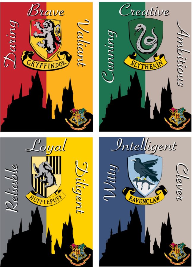
For the final project I was tasked with making a card series and just like the Photshop Final, the Illustrator Final also brought everything I learned through the course around full circle. This project by far took me the longest to complete, but I was very confident in using the pen tool. Each house is…