I decided to take a look at the abstract painter Henri Matisse and his painting The Cat with the Red Fish. What I liked about this particular painting is its ability to create a three dimensional feeling without taking away from what is going on. The cast shadows of the bowl and fruits help to give this feeling of depth from the sunshine of the window. And while the cat is not centered completely in the middle id does draw attention to the bowl of fish and its paw in the middle which is the bigger message of the painting. The red and orange colors complement each other without feeling overpowering or giving the wrong message. Matisse also does a very nice job controlling the whitespace of the painting by filling in those spaces with appropriate colors and shapes that help to enhance the setting and give it a life of its own. Another thing I like about this paintings color is that everything within the room is a different color from what you’d expect for the most part but outside all of the colors are “normal.” So instantly the viewer is instantly attracted to the inside of the room out of curiosity but the outside creates a sense of balance to help the viewer not feel fear of say an “apocalyptic” world outside.
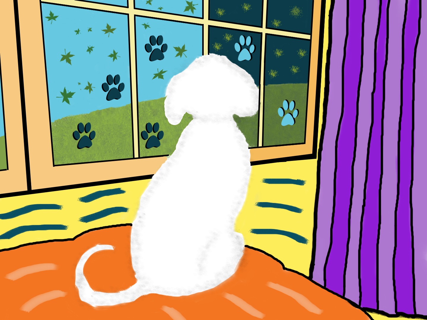
For my painting I decided to do one of my dog whose favorite place in the house is looking out the window. I started off the painting with an outline of him but then as I progressed with filling in the colors of the window and walls I noticed that when I turned off his outline layer it created a sense of closure from Gestalt’s theory, so that the “outline” of him appeared to create a shape itself from the other lines and colors. Then playing around with the different brushes it helped to add a sense of feeling to the painting and create a fur effect on him. As for the framing of the painting, I placed him to lead the lines of the window frame and couch to draw the viewers’ attention to him. For the additional lines I wanted to create a “wave” effect to again draw the viewer to him and not stray too far from the white space and read from left to right from the waves and incline of the hill. For the paw prints on the window, which I got from real life inspiration, I decided to incorporate proximity by placing them near each other and similarity by giving them the same colors on each side of the window. Using the paw prints too helped to create a triangular hierarchy to frame my dog as well as fill up necessary space. I then added a cast shadow to create depth from the window frame and help to further separate the outside world from the inside. I wanted to create a message of day and night and how the world outside can change from day to night but still have similarities in beauty, as the dog notices, while the world of colors inside the house stays the same.
Works Cited
Boulton, Mark, et al. “Whitespace.” A List Apart, 9 Jan. 2007, alistapart.com/article/whitespace/.
Landa, Robin. Graphic Design Solutions. Cengage, 2019.
Skjoldborg Madsen, Rune. “Basic Shapes and Relationships.” Form, Programming Design Systems, printingcode.runemadsen.com/lecture-form/.


Bret,
I really like the varying uses of texture in your abstract painting! That in contrast to the depth perception you create on the layers of the dog prints in the window as well as the window pane itself that is pulling the viewer in is really nice. I also enjoy how although the dog is clearly the center piece of this painting/artwork, it doesn’t necessarily seem that way cause he is off to the side slightly and not as harshly outlined as say the curtain. Very interesting take, I very much enjoyed it!
Hi Bret!
I believe you were successful in accomplishing what you set out to create. I also love that it is dog-themed. I can clearly see your three-dimensional feeling with the windows, along with the fur. Also, as I was looking around the image, my eye was drawn back to the dog with your use of lines and the triangular hierarchy. Nicely done!