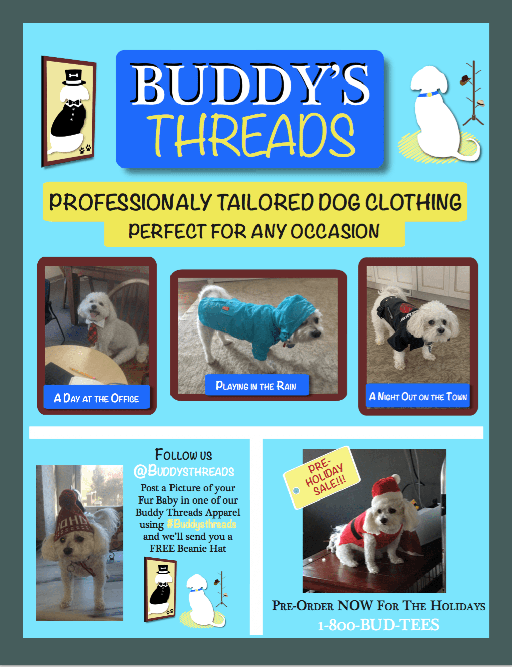
While designing the ad for my brand I knew that I wanted to keep brand consistency a priority from the color palettes to the brand core messages conveyed in the logo. In doing so I brought in the original logo and expanded on the colors of it in the creation of the borders and how the objects and pictures interacted with the edges of it. I also brought in the same title at the top to help introduce the typography choices of the brand so that I had the ability to use them throughout the ad. I also decided to use the visual elements of the logo to help fill in the unnecessary space at the top. Plus according to Kayla Darling in her article 40 Creative and Memorable Logo Designs to Inspire You, image helps to evoke subject and show the purpose of the product and company.
When it came to the composition of the ad I kept in mind the rule of thirds, to help balance the elements while still draw people in, and also harmony. According to Landa in Graphic Design Solutions, harmony is the agreement in composition to construct, arrange, and function elements in relation to one another. And because the logo serves as an entrance to the brand, I was able to expand upon the different areas of it that oculd help cater to a specific area of consumption for pet owning consumers.
Similar to the logo design I decided to keep the colors consistent throughout to not draw attention away from the visual components. However, I did decide to bring in red for a quick hit on the new release of the Santa outfit to catch people’s eyes when exploring the page and promote them to call and reserve ahead of time. Other than that I was very careful with the color choices and made sure to use it sparingly to help draw attention when need be such as to highlight the text name of the brand, Buddy’s Threads, and contact information in appropriate areas of the composition. As for the borders I looked to create a frame feel that made it feel like the pictures of Buddy came right from a dresser or fireplace shelf and create a home comfort and trust for customers.
Landa also highlights a number of important notes for advertising that are directed at the consumers of the brand and ad. Participation and starting conversation was a key point, which is why I decided to include the social media aspect of the ad to spark conversation among people online. A lot of companies ask people to post themselves in their brands to help create exposure and in return they are sometimes featured on the ads page. This helps to create a sense of community for the consumers and introduces them to people who have similar interests and likes, such as pets and their clothing in this case.
Clear communication is also important and so is knowing the purpose of the ad. I wanted to create engagement for consumers but more importantly I wanted to show the different areas of the brand to help people become familiar with it and generate an emotional benefit through the use of visuals and helping people connect back to their own life. There are also multiple opportunities of engagement whether its calling or going on social media which can create a relationship with the brand and help them to remember their experience later on. That is why for the visual hierarchy of this I wanted the ad to be read from top to bottom. Starting with the brand name, Buddy’s Threads, and then showing the inspiration behind it to build trust and examples of what is offered before asking for a “favor” of engagement whether it’s a new or returning consumer.
Works Cited
Baker, Justin. “The Ultimate UX Guide to Color Design.” Muzli – Design Inspiration, Muzli – Design Inspiration, 4 Dec. 2017, medium.muz.li/the-ultimate-ux-guide-to-color-design-4d0a18a706ed.
Darling, Kayla. “40 Creative and Memorable Logo Designs to Inspire You.” Visual Learning Center by Visme, visme.co/blog/logo-samples/.
Landa, Robin. Graphic Design Solutions. Cengage, 2019.
Paish, Chris. “10 Famous Logos and What You Can Learn from Them.” 99designs, 99designs, 31 May 2018, 99designs.com/blog/logo-branding/famous-logos/.