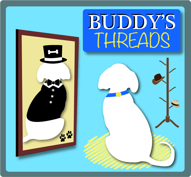
When trying to come up with a logo design I went through a lot of ideas and drafts and even came up with a concept that wasn’t this piece. But as I started the design process with it I felt that something was missing or rather lacking with the idea. So I went back to the drawing board and tried focusing on something that gave inspiration. I did not have to look far as my dog strolled by me in one of his new bow ties. With inspiration and a name for the company, I was ready to start on my logo design and to begin building a brand around it.
During my research on logo and brand design, I came across a few articles which gave their own opinions on the process but mostly centered around the same ideology as to what makes a logo successful in the eyes of the brand and the consumer. According to Chris Paish, in his article 10 Famous Logos and What You Can Learn From Them, the logo should show the personality of the brand. This goes for any logo design whether it’s drawn or photographed and should even be applied to the typeface. This helps to not only make your brand unique but also helps to avoid confusion with others. Chris also talks about how a brand can use color psychology to find the right primary color that fits it. I looked at a number of primary, secondary, and tertiary colors, before finally settling on the color blue. According to the Ultimate UX Guide to Color Design, blue helps to signify trust and intelligence, which are some of the key points of what I wanted to build my brand off of.
For the naming of the brand I decided to do a mix of a founder’s name (my dog Buddy) and explanatory (threads/clothes). And I wanted the typography to be unique but also to represent the brand and give the words texture which is why I went for a bolder and friendlier font with Buddy’s name and a creative and almost yarn like font for the word threads. As for the color scheme I only wanted to introduce a new color if necessary but that also doesn’t mean I wanted everything the same color either.
For the composition of the logo I knew I wanted something simple but also to convey the message and story of the brand. I used the foreground and middle ground to my advantage by composing the images with their size and placement and by adding drop shadows to create depth. I wouldn’t say this piece was a symmetrical composition but I was aware of the midline and tried to place the elements centered near it for reference. I also tried to create a continuity of one element leading to the next with the title then going to the hat rack which led to Buddy and then finally the mirror.
While reading Chapter 11 Branding and Visual Identity of Graphic Design Solutions, I discovered the seven types of logos according to Robin Landa. After reading this section I based my sketches around the idea of having my dog Buddy be the character icon for the brand and logo which could help convey the correct aspects and emotions for it. For this particular brand, dog clothing, I knew from experience and research that people place a lot of trust in brands associated with benefiting their pet, which is why they look for personal ones who have people that know what it’s like to own a pet and the love and work that goes into it. It should convey something that the owners will like but more importantly too something their pets will love.
Works Cited
Baker, Justin. “The Ultimate UX Guide to Color Design.” Muzli – Design Inspiration, Muzli – Design Inspiration, 4 Dec. 2017, medium.muz.li/the-ultimate-ux-guide-to-color-design-4d0a18a706ed.
Darling, Kayla. “40 Creative and Memorable Logo Designs to Inspire You.” Visual Learning Center by Visme, visme.co/blog/logo-samples/.
Landa, Robin. Graphic Design Solutions. Cengage, 2019.
Paish, Chris. “10 Famous Logos and What You Can Learn from Them.” 99designs, 99designs, 31 May 2018, 99designs.com/blog/logo-branding/famous-logos/.


