In all that we do in life, there comes certain points in time when we must choose between what we want to do and what we know is right. And by that measure we determine the outcomes for better or worse. Present in this photo essay are the choices between what we want to do and need to do. While it is easy to choose what we find passion and inspiration, it is the strength that defines people who are able to take the path of righteousness and do what they know deep down is the right thing for that moment in time. Over the years I have seen my sister grow up with the game of basketball. It drives and motivates her. But now that she is in high school she’s beginning to learn that sometimes academics have to come before the game in order to succeed on and off the court.
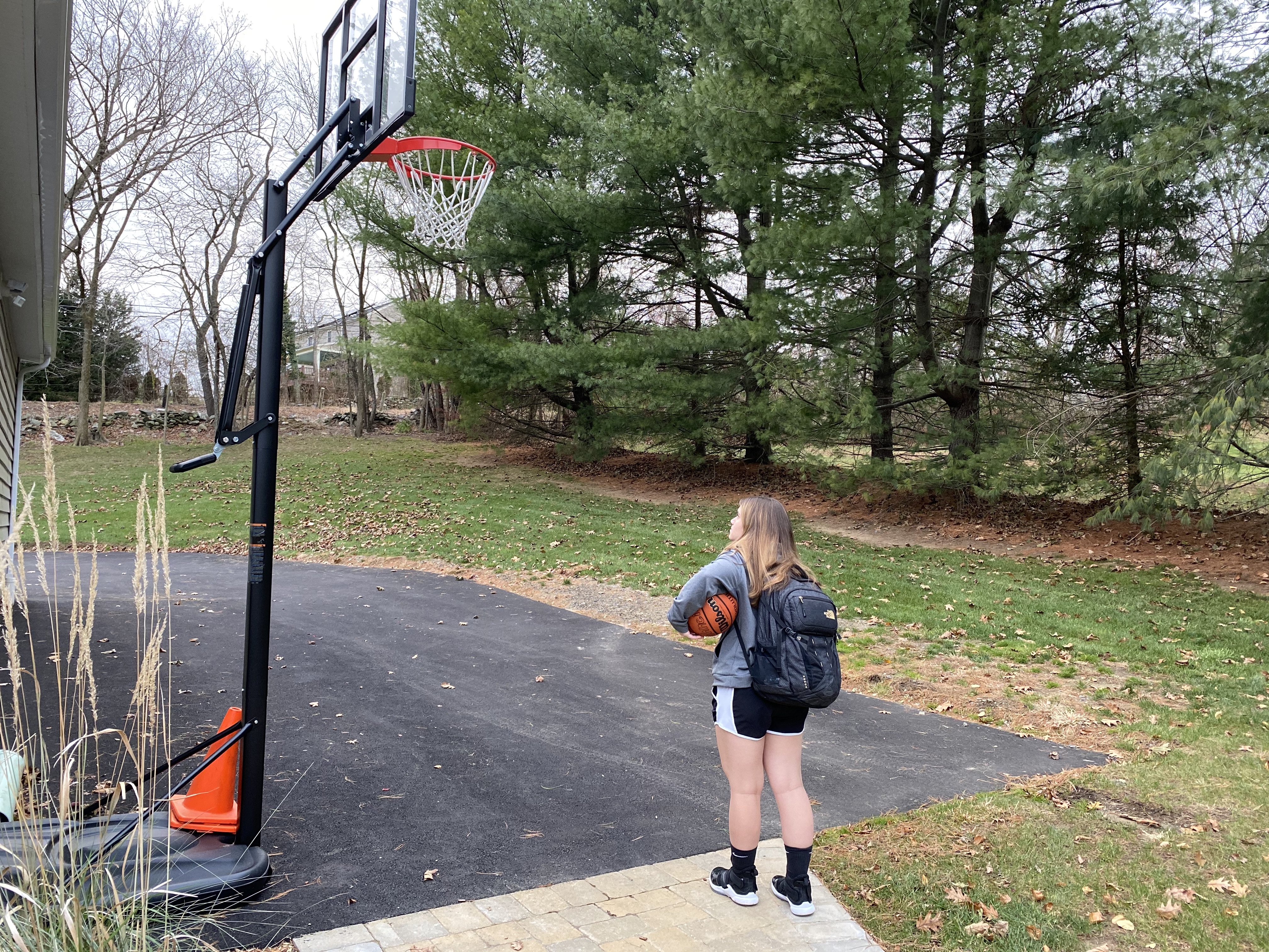
Hearing the call for the passion the game

Knowing the priorities
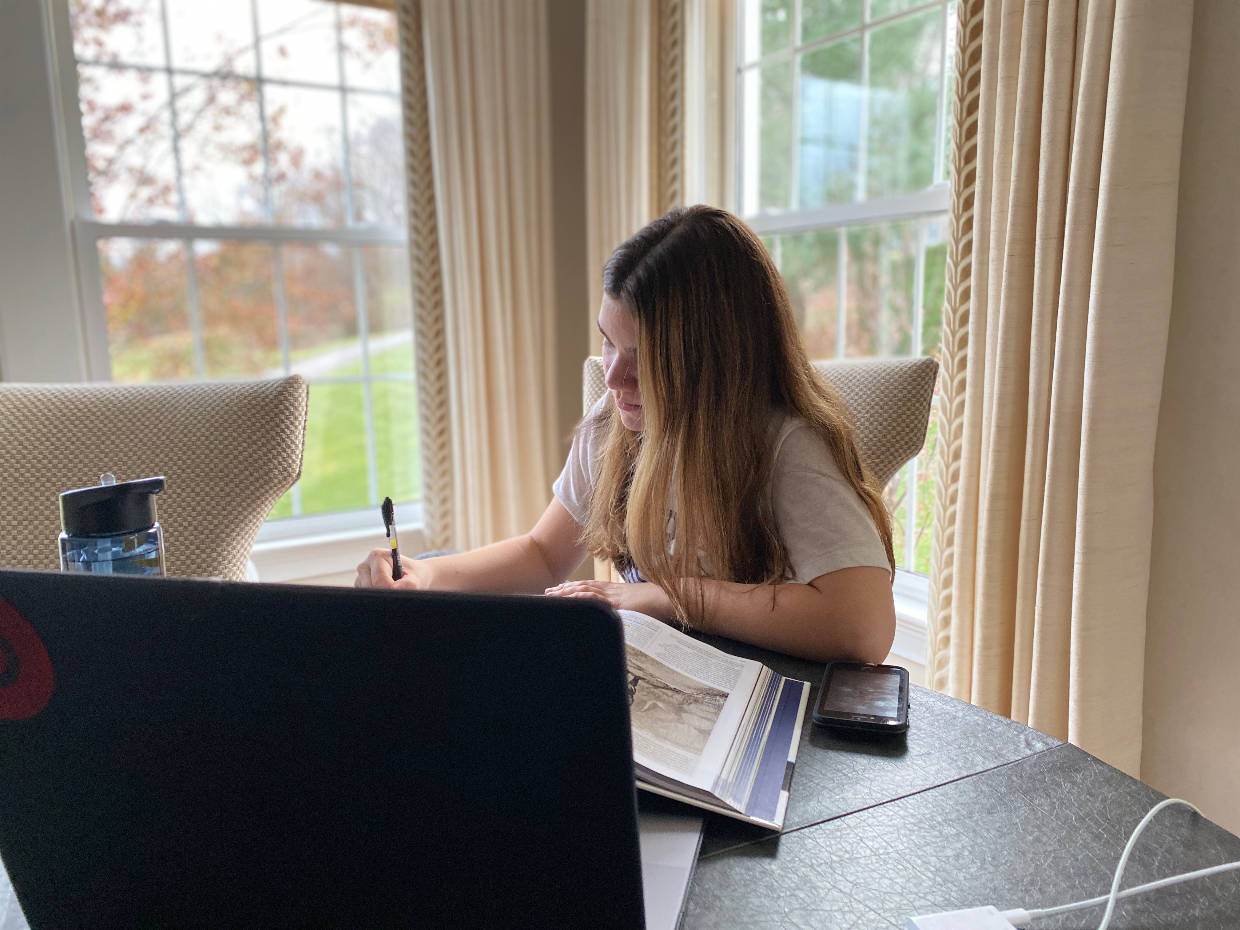
Putting the time and effort in
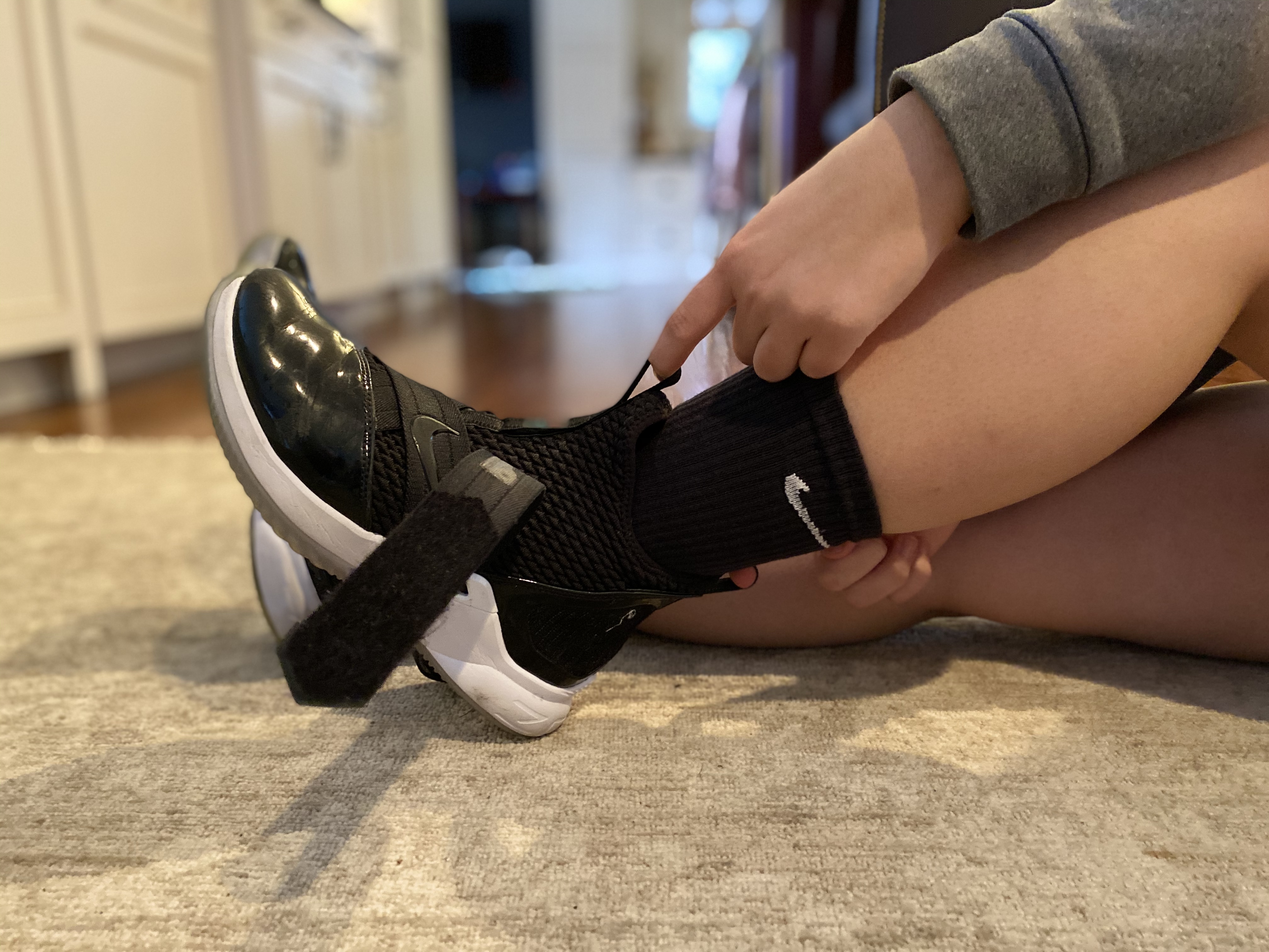
Lacing up
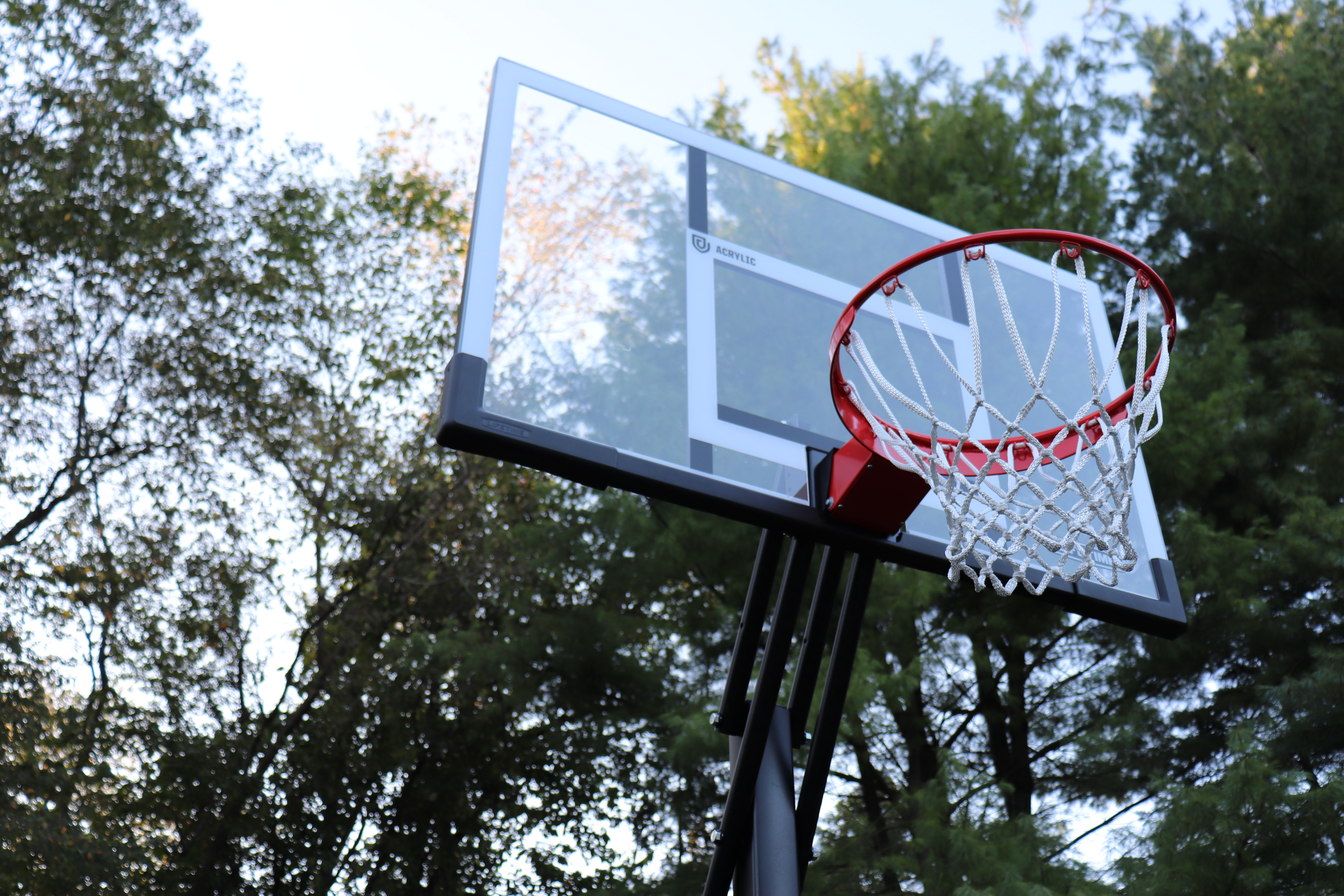
Lining up to the target
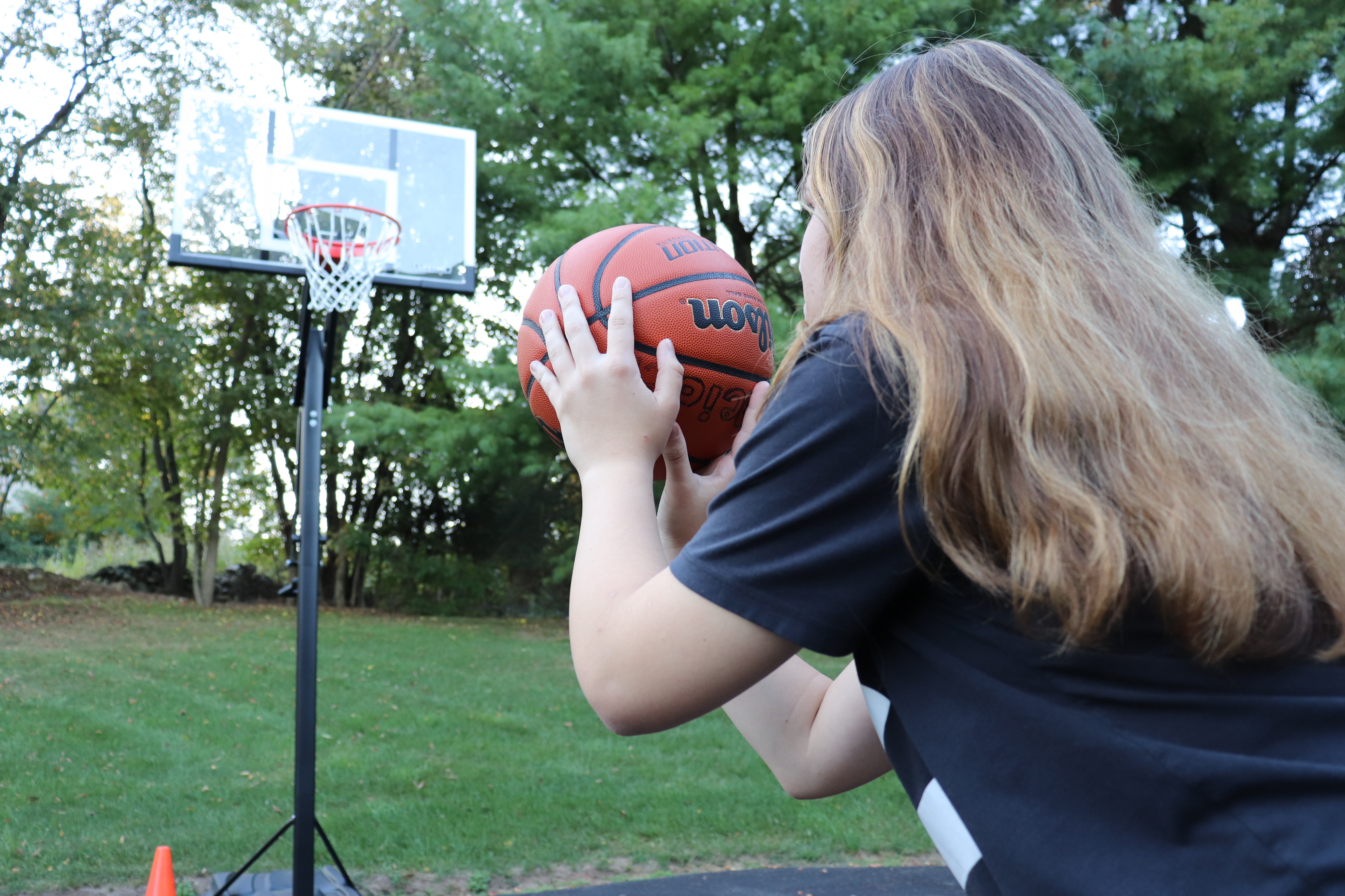
Putting all focus and attention on the task at hand
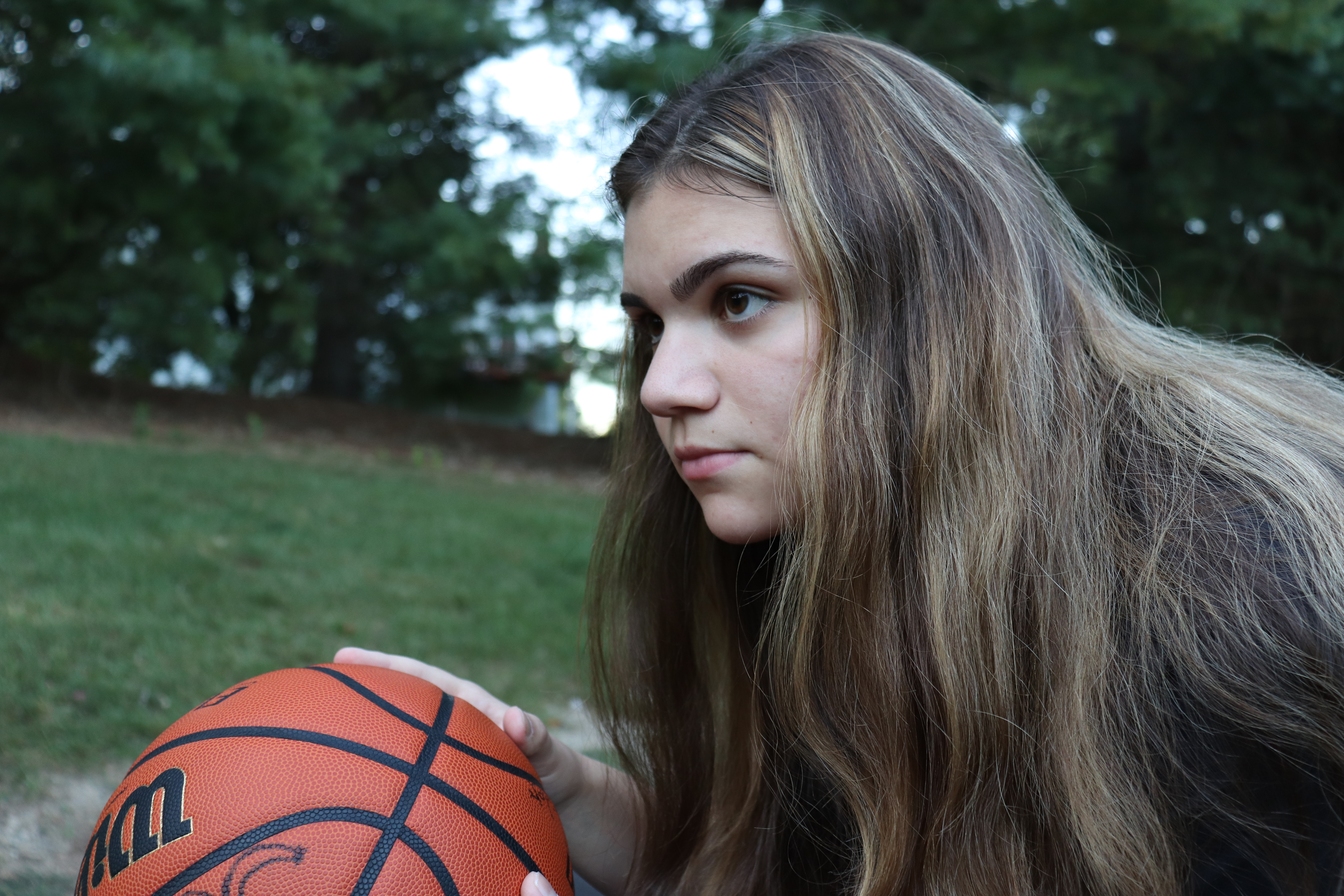
Target in sight but not focused enough

The call of unfinished business

Making the realization
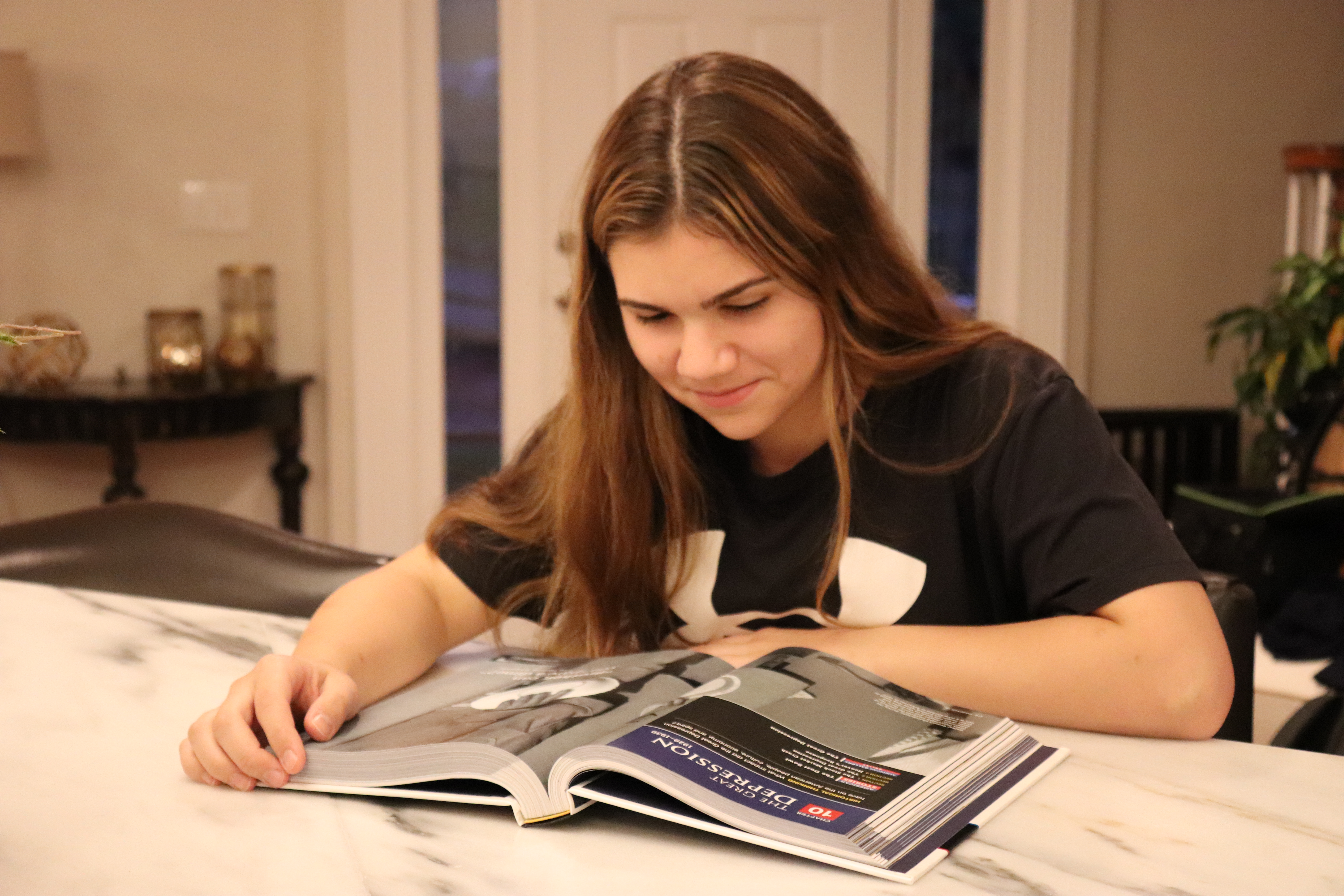
Finishing what was started
Even though we are faced with these kinds of choices in life, the key to our better understanding and potential comes from balance. Rather than having to choose one or the other, we should make time for both passion and work. Having one without the other makes it meaningless if we are without a goal or compensation. But if we strive to make the time and commitment to completing both, then the guilt of not having or completing the other will be less apparent if not completely vanished. The strive to finish a book can help one to better focus and clear their mind when shooting a free-throw.
Part 2
My goal for this photo essay project was to tell a story through photographs that not only gave a linear storyline but also one that went deeper into the understanding of what the character was thinking and feeling without the use of audio and words. As Eman Shurbaji puts in their article, “photos have an exact representation of moment” (Shurbaji). And with that a visual storyteller should be able to build on those moments to create a central theme that is communicated through these moments that share the same emotion or show the different stages of it through the story. The four core elements for creating an effective visualization are visuals, information, story, and goal (McCandless). That is why it is important for all visuals to be effective in their storytelling by giving the viewers information and not just marveling at the shots.
It is the role of the storyteller to engage the audience with situations (Campbell). And on that note I made sure that my pictures in this piece engaged the audience with situations. So I would categorize my pictures as focusing on the story while also establishing the setting and defining the characters. Scenarios can affect the different techniques and structures being used for storytellers (Watson). For this situation I knew all my pictures had to establish their settings in terms of the time of day and location they were taking place in. The room in which the character found themselves in along with their emotions in the picture would help to further define their characters and motive behind each picture. That is why I chose to include reaction shots if you will of the characters faces to help tell the emotions in the story. There was one shot taken behind the character but only to reveal what they were looking at.
These pictures can be described and analyzed as driving the story and theme without the need for captions and text. Good visualization should be able to tell a story and remove the noise (Tableau). When taking these pictures, I made sure that everything within the frame helped to add to the central story and further understanding for the viewers and not distract them from what was intended. Some design principles I followed are creating a photo essay. There are three ways to tell stories according to Shurbaji: photo essays, photo packages, and a photo story. What differentiates a photo essay from the rest is that it should have an overall topic or theme that creates a bigger picture in the end. I also made sure to use the principle of element connectedness which is perceiving elements as being united through their elements (Bushe). To do this I kept the color patterns and schemes as well as the lighting and framing similar in all the shots to help tell the story in over the course of time and differentiating day from night to help add a sense of reflection and time-lapse to add to the theme.
Some techniques that I used are using close-up shots to grab instant emotional reactions from the viewers so that they are instantly drawn into the story. Even though most of the pictures are closer than others, the viewer is able to piece together the scene and subject locations through the other visuals and use that knowledge when looking at whatever the current picture is in the story. Nicole Dahem best explains it in her article How to Do Better Visual Journalism for Solutions Stories as, “The idea is to make images that matter to the specific story, rather than seeking visuals afterward that ‘fit’” (Dahem).
Works Cited
Busche, Laura. “Simplicity, Symmetry and More: Gestalt Theory and the Design Principles It Gave Birth To.” Learn, Canva, 15 May 2019, www.canva.com/learn/gestalt-theory/. (Module 2)
Campbell, David. “Why It’s Time for Visual Journalism to Include a Solutions Focus.” Medium, Witness, 17 Sept. 2019, witness.worldpressphoto.org/why-it-is-time-for-visual-journalism-to-include-a-solutions-focus-5be15aec3afc. (Module 4)
Dahmen, Nicole. “How to Do Better Visual Journalism for Solutions Stories.” MediaShift, 2 Dec. 2017, mediashift.org/2017/11/visually-reporting-solutions-stories-newsrooms-classrooms/. (Module 4)
Garcia, Mario R. “Blog: Digital Storytelling, Part One: The Fusion of Writing/Editing/Design.” García Media, 19 Jan. 2017, www.garciamedia.com/blog/digital_storytelling_part_one_the_fusion_of_writing_editing_design/. (Module 4)
McCandless, David. “What Makes A Good Data Visualization?” Information Is Beautiful, Information Is Beautiful, 17 July 2018, informationisbeautiful.net/visualizations/what-makes-a-good-data-visualization/. (Module 3)
Reason, Ron. “WED: The Integration of Writing/Editing/Design.” Poynter, 20 Aug. 2002, www.poynter.org/archive/2002/wed-the-integration-of-writingeditingdesign/.
Shurbaji, Eman. “Photo Narratives.” Medium, Ideas: Journalism + Tech, 17 Dec. 2014, medium.com/learning-journalism-tech/photo-narratives-d77b812f99dd. (Module 4)
Tableau. “Data Visualization Beginner’s Guide: a Definition, Examples, and Learning Resources.” Tableau Software, www.tableau.com/learn/articles/data-visualization. (Module 3)
Watson, Hugh. “Data Visualization, Data Interpreters, and Storytelling.” Research Gate, 2017, www.researchgate.net/publication/316605154_Data_Visualization_Data_Interpreters_and_Storytelling. (Module 3)


Brett, Overall I found your images to be very powerful, well framed, and united in their theme of your story. As you mentioned in your own analysis, the two different settings (in the house, and outside on the court) helped to further propel your narrative forward. Your photography skills are excellent – the images were sharp and well conceived. You made good decisions about distance that helped to play on our emotions – for example the first photo which is zoomed out, where your sister is small compared to the basketball hoop, contrasted with the photos where you zoom in like her hands removing the notebook from her bag.
On their own, each photo conveys a lot of emotion. Together, the photos do tell a story of someone who clearly loves basketball, but is also serious about studying. I think that comes through in your photos as a collective. However, the narrative itself was a little harder for me to untangle. The photo shows your sister highly engaged in her work – but the next thing we know she is lacing up her shoes. I wanted to see a photo (or series) which showed the conflict – her desire to play rather than study. Perhaps she could be distracted from the books and staring out the window. Or the basketball could somehow come into the shot and she could glance longingly at it. I think for me, that transition was missing.
Because of that, I think we did need the captions. I would have loved to see captions that were slightly more descriptive to tell the story. However, I think if there was a shot showing that critical moment, you wouldn’t have needed the captions at all!
You are clearly a gifted storyteller and photographer…you did a great job with this assignment.
Hi Bret.
Let me start by saying I think your essay was well done. With the exception of one photo, the story unfolded well, even without the captions. The angles you used were visually appealing and I liked the variety of types of shots. You set up the introduction well and your message was delivered in a succinct fashion.
I also liked your statement “The strive to finish a book can help one to better focus and clear their mind when shooting a free-throw.” I almost felt like you could have added another shot of her going back to the net with a satisfied look on her face because she had her priorities in the right place.
One critique for your consideration. Although all the pieces were there, I think you could have added a bit more emotion by expanded your captions a bit. What was she thinking at the moment she decided to go back to her studies? Was she frustrated? Annoyed? Maybe add a shot of her face that captures that expression to give it a bit more emotion. But all in all, nice job!
Thanks for sharing.
Best-
Holly