While the designer is responsible for creating the content that they feel is most effective in storytelling, it is also in their responsibility to take into account how viewers and users will interpret it when they see it and recall on it later on when building their hypotheses on past experience. To create an effective design that tells a story, the most powerful tool and ally is emotion, or more specifically emotional intelligence. Emotional intelligence focuses on the awareness and management of emotions. But in order to be an effective designer, emotional intelligence should be utilized by designers who train it by exploring empathy to design for people of different social backgrounds, as Ellen Lupton explains in her book Design in Storytelling. If the designer is not able to empathize with the viewer, then the connection and interested in the piece could be lost or less effective than intended.
In order to better understand the user experience in how people interact with designs, Lupton breaks down the three phases in which people can interpret visual work. The first is visceral which is what people process right then and there. The second is behavioral which focuses on any action taken by the users. And finally reflection which is what people recall from the experience later on down the road when they find the information useful. But going back to the emotion and empathy of a piece, designers can find aid in conveying the right emotions through color. Color can help to create a sensory impression that not only can reflect mood but also emotion (Lupton). But in order to use color effectively, designers have to make sure they use the right colors at the right time. One way to do this is by referring to the Plutchik wheel which was designed by Robert Plutchik to help organize all the emotions into a diagram that functions just like a color wheel. This helps designers to better understand the connection between emotions and colors for users.
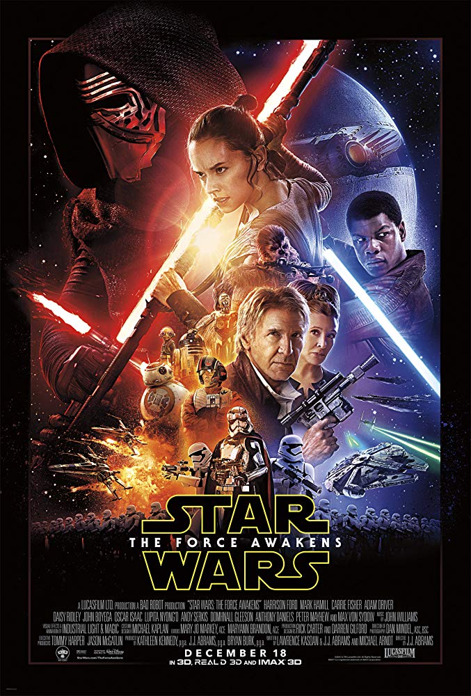
In this poster for Star Wars: The Force Awakens, there are a number of different colors used to portray the different emotions seen on the characters present. With any Star Wars movie the storyline summed up is usually light vs dark/heroes vs villains. Naturally this message is also used in their marketing materials to show the power struggle. Looking at the Plutchik scale for this poster, The color red represents the rage and anger of the films villain Kylo Ren. The red light that outlines his character and shadows show his anger and trust in the dark side as even though the viewers can’t see his facial expression their mind still indicates to them the emotions he is feeling. And the red lightsaber fuels his rage as the color red perhaps shows him gripping the lightsaber tighter than the other characters in the poster.
The color blue in this poster could represent grief but it depends on what subject the viewer focuses on within the poster. The character Finn holding the lightsaber in the blue light shows his allegiance to the light side and will to fight. But behind him sits the Starkiller Base from the movie which causes the destruction of a planet and kills millions of innocent people. Unfortunately, people looking at this poster out of context wont associate with the sad shade of blue but the balance of coexisting the red and blue is very effective in wanting to tell the story of good vs evil in this poster. The colors each evoke a specific mood, or vibrancy, and complement each other (Cao). One last color I want to point out is that of Rey (kind of a yellow-orange one) which highlights her as a point of interest and anticipation according to the Plutchik wheel. Her center position and highlight with this color helps to show the viewer that the main story also revolves around her character and her discovery of the force.
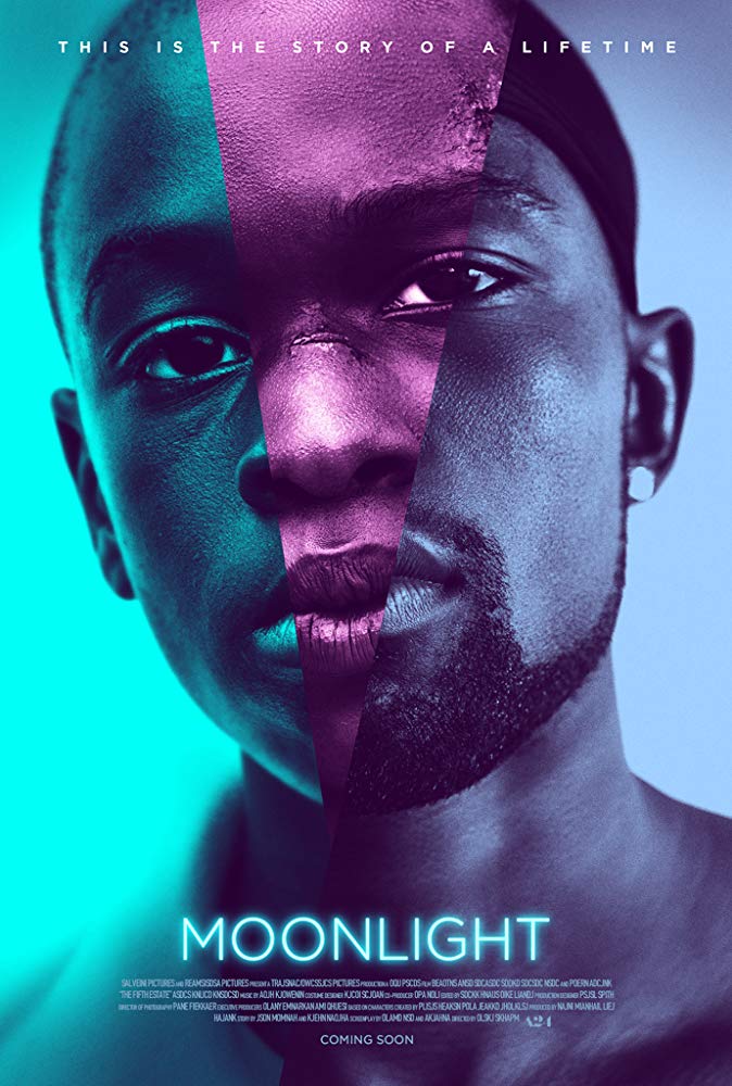
The poster for the movie Moonlight also evokes a number of emotions through its use of colors and gestalt principles. Similar to the design of the X-Men poster in my earlier blog, this poster utilizes continuity to have the elements, the character’s faces, associated with each other as one subject (Bushe). Even though there are three faces present, they are perceived as one head together and the same person through the course of a lifetime. The help the story read from left to right on the face as the character Chiron grows from a child to a man. The lighter blue represents Chiron’s childhood and feelings of distraction and innocence from the dangers of the world around him. The color purples then bring in a new emotion of mystery as Chiron reaches his teenage years and begins to explore himself more. Not only does the purple evoke this feeling of mystery for the audience but it also highlights the scars on Chiron’s forehead and nose which makes the audience feel empathy and also question where the scars came from. Finally, the last blue color shows the grief and sadness of Chiron as he has taken the path down a road he’s always tried to avoid. It’s interesting that all three faces have the same expression yet the color on each of them tells a different story as he becomes hardened over the course of the years. This supports the idea that there is a link between emotions and colors (Cao).
The power of emotions in visual storytelling and design is very evident. It has the power to help enhance the emotions conveyed to the viewers and help the designer connect and empathize to create a more effective piece. But at the same time there does run the chance of the viewer having a different perspective. Donald A. Norman in his article Designers and Users: Two Perspectives on Emotion and Design, brings up how emotions are a special but salient form of affective reaction which resides in the user of a product and not the product alone. This leaves the door open for the user experiencing emotions that weren’t intended by the designer initially, or as Norman calls it emotion by accident as oppose to emotion by design. That is why it is so important for designers to follow the guidelines given such as the Plutchik wheel and Gestalt principles but also remember to trust themselves in empathizing with the users and visualize how they would react to their work.
Works Cited
“Act 2 Emotion.” Design Is Storytelling, by Ellen Lupton, Cooper Hewitt, Smithsonian Design Museum, 2017, pp. 56–111.
“Act 3 Sensation.” Design Is Storytelling, by Ellen Lupton, Cooper Hewitt, Smithsonian Design Museum, 2017, pp. 112–151.
Bonner, Carolann. “Using Gestalt Principles for Natural Interactions.” Thoughtbot, 23 Mar. 2019, thoughtbot.com/blog/gestalt-principles.
Busche, Laura. “Simplicity, Symmetry and More: Gestalt Theory and the Design Principles It Gave Birth To.” Learn, Canva, 15 May 2019, www.canva.com/learn/gestalt-theory/.
McLeod, S.A. (2018). Visual perception theory. Simply Psychology. https://www.simplypsychology.org/perception-theories.html
Norman, Donald A. Interactionivrea. Nielsen Norman Group, projectsfinal.interactionivrea.org/20042005/SYMPOSIUM%202005/communication%20material/DESIGNERS%20AND%20USERS_Norman.pdf.
Reeder, Jay. “What Owning an Alpaca Farm Has Taught Me about Running a Tech Startup.” Podium | The Next Web, 1 Nov. 2019, thenextweb.com/podium/2019/11/03/what-owning-an-alpaca-farm-has-taught-me-about-running-a-tech-startup/.
Photos
Star Wars: The Force Awakens
https://www.imdb.com/title/tt2488496/mediaviewer/rm527556608
Moonlight
https://www.imdb.com/title/tt4975722/mediaviewer/rm1452607488


Hi again Bret,
Another great job with this post. Your explanation regarding user experience and interaction was easily understandable and led well into your photo set. As designers, we must always think about how viewers and users will react with what we make, and what they will feel because of this. Sometimes, people forget this important aspect of designing, and they end up with a response they may not have wanted (hence, controversial clothing designs and advertisements). I enjoyed how you also ended the opening, connecting emotions to colors. Without colors, emotions would not be heightened in the viewer.
I really liked your description for the use of Moonlight’s color palette for their movie poster. I can completely agree with your explanation because each color is reflected through these different stages in his life. He is finally himself in the end, but a lot sadder because of how his life has shaped him as an adult.
I would have liked to see what emotions you thought were expressed in both of these posters, and what emotions were evoked from the audience’s perspective. Are they different? Do we feel like the characters do? I would love to hear your thoughts that distinctly describe how the audience feels after looking at these.
Bret, nice job in explaining the three elements of UX: visceral, behavior and reflective, as described by Ellen Lupton. In order for design to be effective, these elements are integral.
As you mentioned, color is also essential in visual storytelling and showcasing emotion. I enjoyed your interpretation of the “Moonlight” poster and the choice of colors (lighter blue/teal, purple and blue). Each one illustrates the three main stages of Chiron’s life. The designer also adopted Gestalt’s principle of symmetry–the three faces are mirror reflections of each other.
My only recommendation is for you to describe the differences between expressing vs. evoking emotion. What emotions were intended to be displayed, and what were evoked and interpreted by the viewer?
–Julia