Since the dawn of time humans have been equipped with five different senses to help them learn more about the environment in which they live: sight, sound, feel, smell, taste, and touch. Richard Gregory also proposes the idea that perceptions people make about the world around them are hypotheses based on past experience and stored information (McLeod). Combine the senses with the information people store about the world around them and that is how people are able to perceive and sense everything. But what Gestalt proposes is that instead of understanding all of the individual parts, people should focus on understanding the whole (Bonner). This can be broken down into the principles of similarity, enclosure, continuation, closure, proximity, and figure ground. Below are three pictures that I have chosen that each represent the same emotion but at a different intensity from the Plutchik wheel.
Annoyance
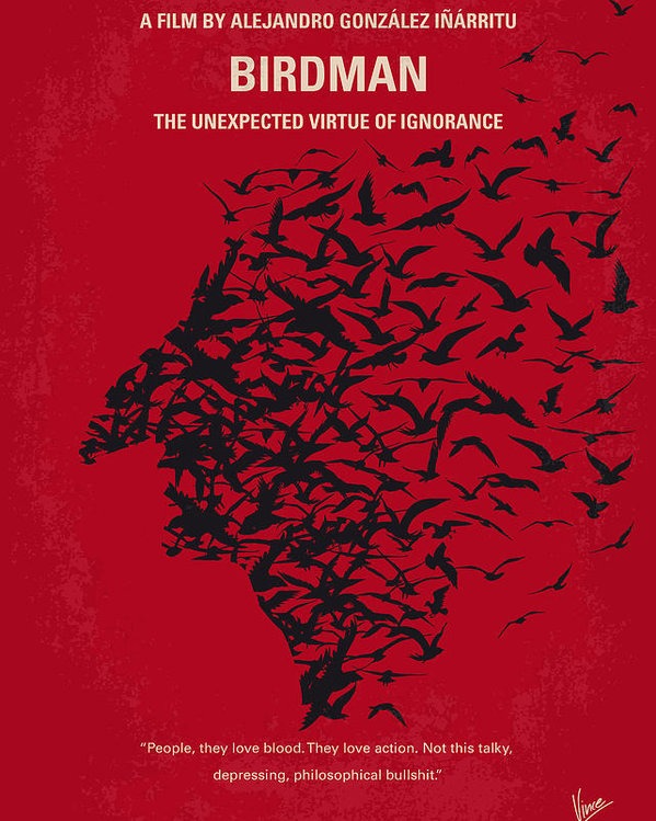
This poster from the movie Birdman or (The Unexpected Virtue of Ignorance)is a good example of using the gestalt principle of common fate. Common fate is when the visual elements move together in the same direction and are seen as a group (Bushe). Again the goal is to have the people understand the whole rather than parts. Here the flock of flying birds come together to form an outline the mask of the character Birdman. Rather than having the birds all crunched together to make the outline more apparent, the designer decides to have them scattered towards the right of the poster for emotion. In the film, Riggan’s character is very scattered emotionally as an alternate persona of his famous film role in Birdman comes out while he tries to make final preparations for his new Broadway show. As for the choice in red for the background, this color helps to display the emotion of annoyance on the Plutchik wheel but can also be seen as a form of power driven by the flock of birds coming together to form one man.

Anger
The movie X-Men: Days of Futures follows Wolverine as he travels from a distant and apocalyptic future back to the past to find the younger versions of Charles Xavier and Magneto and convince them to help stop the event that triggers it. Naturally the promotional art for this poster focuses on both the older, Ian McKellen, and younger, Michael Fassbender, versions of Magneto. This image is very powerful in its use of the “X” and color red to represent anger in its storytelling. While the older version of Magneto has realized his reign of terror and fear is no longer the answer to saving mutants, his younger self is still set in his ways of revenge and anger to hurt mankind for what they have done to mutants. This is portrayed by his outline of red especially over his eyes. If the color was simply just black and white the emotions of the face could be conveyed differently for the viewer. What this poster utilizes very effectively though is the principle of continuity. Continuity happens when elements are associated with each other by aligning near each other (Bushe). Even though there are two faces present, they are perceived as one head together. Two men of the same identity but from different times. Symmetry can also be seen here as symmetrical elements are being perceived as part of the same group (Bushe). The lines of the “X” help to shift the focus of the subject but keep the shape of the full head intact and not disrupt the continuity.

Rage
The cover for the videogame Red Dead Redemption II shows a lot of emotion in a man who looks in rage and hits the peak on the Plutchik scale. What makes this an effective visual is the use of the color red not only in the background of the setting sun but also in the shadows on the cowboys face that outline his expression of rage. Below him though the red settles in with the black dust/rubble which combined looks like that of splattered blood suggesting violence with the men on horses pictured. These men are effective in the visual because of the similarity principle because they all look alike both in size and color. But perhaps a better example of this is the red starts beneath them and around the title which resemble that of an American flag. Even though the full flag is not pictured and complete, the viewers can perceive the objects to be part of a group and same pattern (Bonner). Even the ESRB rating using the enclosure principle with the white line around the box to create a boundary to show it is a separate icon from the games setting. Another principle used in this piece is closure which is seen with the sun and tree outlines in the background. Although the sun and trees are not completed in shape form, there is enough of them seen for the object to be perceived by the mind which mentally fills in the rest for the viewer. This is where the information people keep stored in their minds from senses comes into play.
The Gestalt principles were created to help both the visual creators and the viewers. For the creators it helps to put into perspective how the viewers will look at the work they have created and hope that the principles they utilize help to tell the visual story. These principles help to explain not only when but also how people’s minds perceive different visual components as being part of the same group (Bushe). And while everyone in the world is brought up on different cultures and education, visual storytelling still proves to be the most powerful in connecting people through a language of its own in storytelling and powerful imagery from the creators who use Gestalt to tell their stories.
Works Cited
“Act 2 Emotion.” Design Is Storytelling, by Ellen Lupton, Cooper Hewitt, Smithsonian Design Museum, 2017, pp. 56–111.
“Act 3 Sensation.” Design Is Storytelling, by Ellen Lupton, Cooper Hewitt, Smithsonian Design Museum, 2017, pp. 112–151.
Bonner, Carolann. “Using Gestalt Principles for Natural Interactions.” Thoughtbot, 23 Mar. 2019, thoughtbot.com/blog/gestalt-principles.
Busche, Laura. “Simplicity, Symmetry and More: Gestalt Theory and the Design Principles It Gave Birth To.” Learn, Canva, 15 May 2019, www.canva.com/learn/gestalt-theory/.
McLeod, S.A. (2018). Visual perception theory. Simply Psychology. https://www.simplypsychology.org/perception-theories.html
Norman, Donald A. Interactionivrea. Nielsen Norman Group, projectsfinal.interactionivrea.org/20042005/SYMPOSIUM%202005/communication%20material/DESIGNERS%20AND%20USERS_Norman.pdf.
Reeder, Jay. “What Owning an Alpaca Farm Has Taught Me about Running a Tech Startup.” Podium | The Next Web, 1 Nov. 2019, thenextweb.com/podium/2019/11/03/what-owning-an-alpaca-farm-has-taught-me-about-running-a-tech-startup/.
Posters
Birdman or (The Unexpected Virtue of Ignorance)
https://www.imdb.com/title/tt2562232/
X-Men: Days of Futures Past
https://www.imdb.com/title/tt1877832/mediaviewer/rm2499729664
Red Dead Redemption II
https://www.gamestop.com/video-games/playstation-4/games/products/red-dead-redemption-2/10138091.html


Hi Bret,
Well done! I think you did an excellent job first describing what exactly the blog post is about, and then showcasing the power of colors and the Gestalt theories in each photo. Each explanation was spot on, especially the X Men: Days of Future paragraph. I believe that the red X is also not just to signify the X Men, but is to also signify the anger that is the focus of the movie. Without the red, we would not feel that there is trouble coming. With the red, the emotion of the character on the poster is exemplified in a way that lets us know something big and bad is going to happen, especially since it encompasses the younger version of himself. I wonder if it is used to also bring up the fact that Magneto has never truly changed. He may claim he has given up, but could he be hiding his true self and just lying?
On another note, I thought you connected each picture back to your research and readings in a professional way. Your explanations and research to back each up made for an easy and understandable read. As the viewer, I could connect what you had brought up right back to the poster or game cover with ease. Great job!
Bret, nice job in illustrating the different examples of Gestalt principles. I especially like the “Birdman” poster, in which at first glance, the image appears to be a flock of birds flying. However, using the common fate effect, the image is an outline of the Birdman’s face.
The “X-Men: Days of Futures” poster is a good example of symmetry. The two faces of Magneto are mirror reflections of each other.
I agree with your interpretation of the use of the color red on all three posters to signify rage.
My recommendation is to explain what the Plutchik wheel of emotion is for those who aren’t familiar with it. Otherwise, terrific job.
–Julia